AB Ukrainian Investments logo
About the client: AB Ukrainian Investments is the leader in investment services in Ukraine.
Task: development of a corporate logo for AB Ukrainian Investments
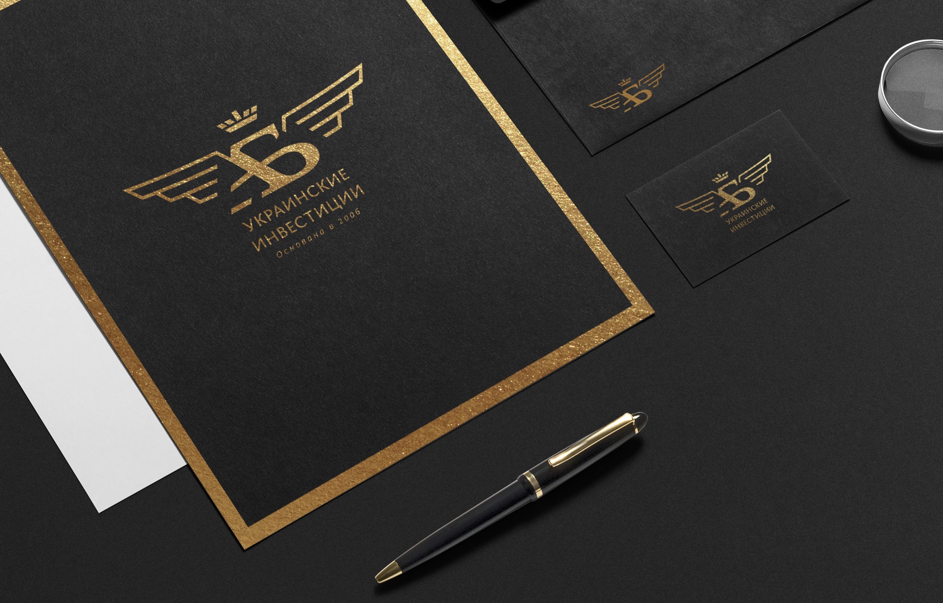

The development of any logo always starts with a concept. The AB Ukrainian Investments logo concept has a clear design and clear writing. The sign is based on a combination of two letters "A" and "B". The sign contains the image of wings as a symbol of financial takeoff. And the crown, a sign of victories, dignity and honor.
The logo is based on an equilateral triangle. Developing in geometric forms, gives rise to harmonic constructions. It is supposed to take this figure as the basis for building a corporate identity.
At the stage of logo development, an analysis was made of brand logos that correspond to the status of the target audience. In these logos, the composition is based on a clear associative sign, made either from a combination of letters or from an image-symbol. The year is also often present.
The logos of the leading companies have a clear, precise design in their graphics, which is close in nature to the target audience.
The basis of the logo is the sign, the text spelling of the company name and the year - the date of foundation of the company.
The corporate mark is formed by the plexus of two letters "A" and "B". There is an image of wings in the sign, which has a slight bend, which gives dynamics to the sign. The thickness of the wings is made somewhat thinner than the strokes in the letters. This gives them lightness, and the letters play the main role in the sign.
The sign is crowned with a crown, forming a conditional triangle with its apex pointing upwards as a symbol of stability. The crown is made in accordance with the modular grid of the entire sign, and the size of the elements echoes the rest of the participants. It is also possible to use the date of foundation of the company in the mark.