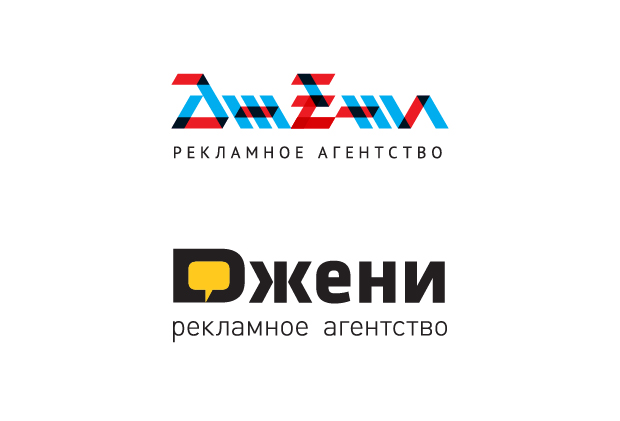
Janie logo redesign
About the client: Janie is an advertising agency. He owns all the billboards of Belgorod, and if they don't, they will.
Task: redesign the logo.
The name "Genie" comes, according to a reliable source, from the Latin word "genius" - genius, and it originated in the foggy nineties. Actually, the design was completed around this time.

With little information, we set to work. After analyzing and reflecting, we came to the conclusion that the combination of Cyrillic letters in the logo is not the most successful, which explains the appearance of the Latin "D". However, such a grapheme exists in school copybooks, so the use of a “not quite alien letter” can be considered acceptable - we left it. In the process, we came up with two polar versions of the logo. In one version, we combed and washed the existing one, and in the other, we radically proposed a different style. The customer was dismayed.

On the one hand, he wanted radical changes, on the other, he was not ready for them. And he delivered a verdict: “We need a third option, which will combine the advantages of the two proposed!” We went ahead, opened the logos in the wonder program, and applied the "creativity" filter to 50%. The result pleased everyone. Now Janie has a good logo and we have another satisfied customer.


