Corporate style of Voznesenovsky feed
About the client : Micronized horse feed business.
Task : to develop a logo and corporate identity for a new brand of micronized horse food.
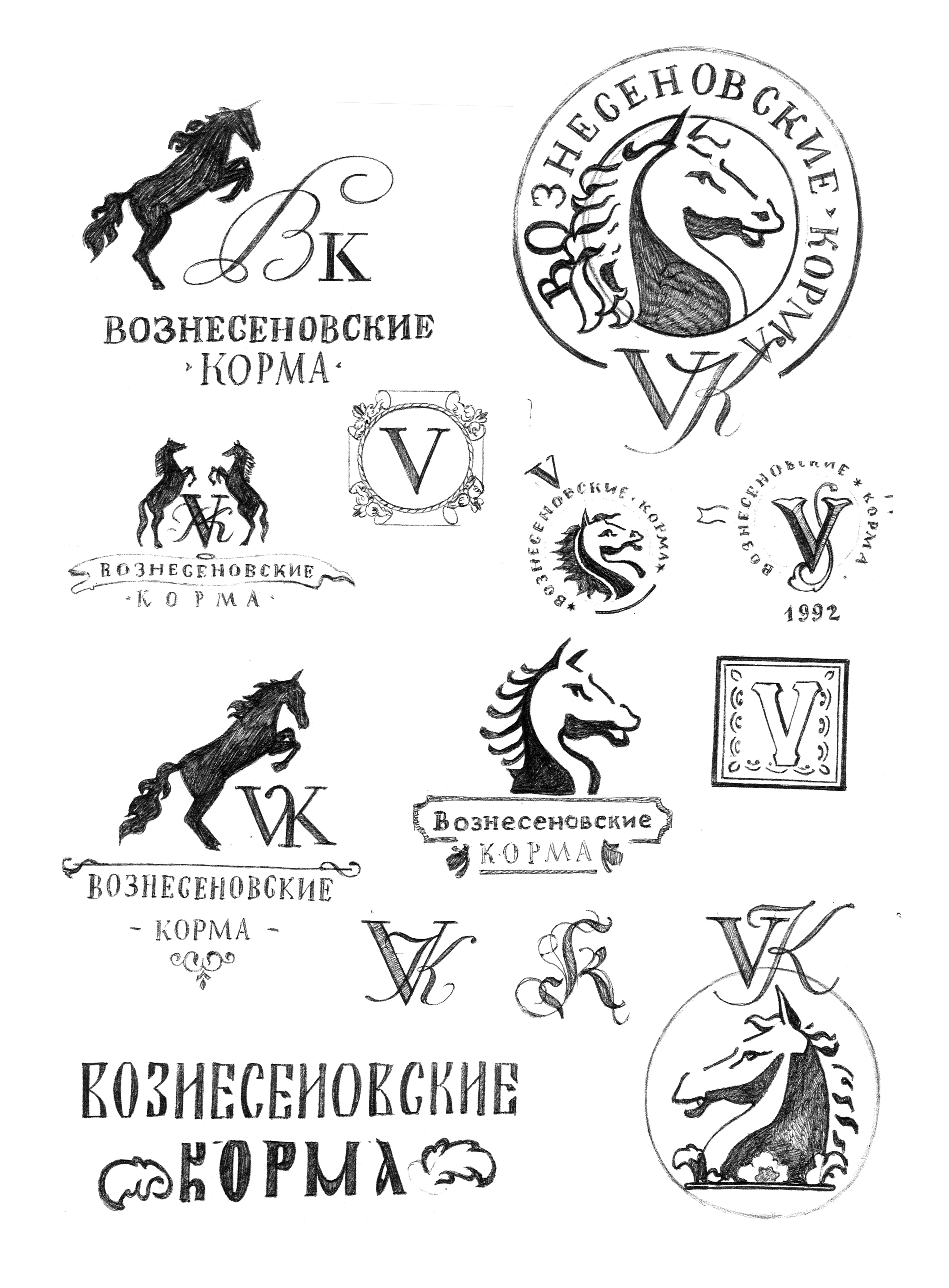
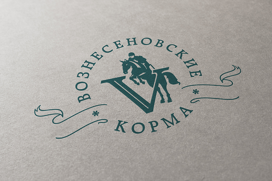
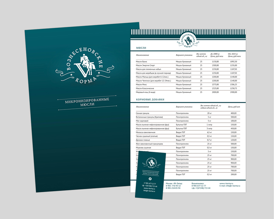
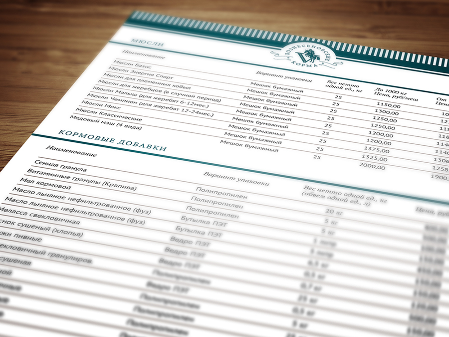
We started with the logo. According to the customer, it must have included a horse, the Latin letter "V", and something that characterizes the sport. We made a sketch search in stylistic bins, from the Baroque and Victorian era to Russian Art Nouveau. We settled on the image of an athlete jumping from the letter "V". After that, they continued to work on the color, which was supposed to enhance the impression of elitism and luxury. Dark turquoise was unanimously chosen. Well, then it went like clockwork: fonts and typography, modular grids and photos.
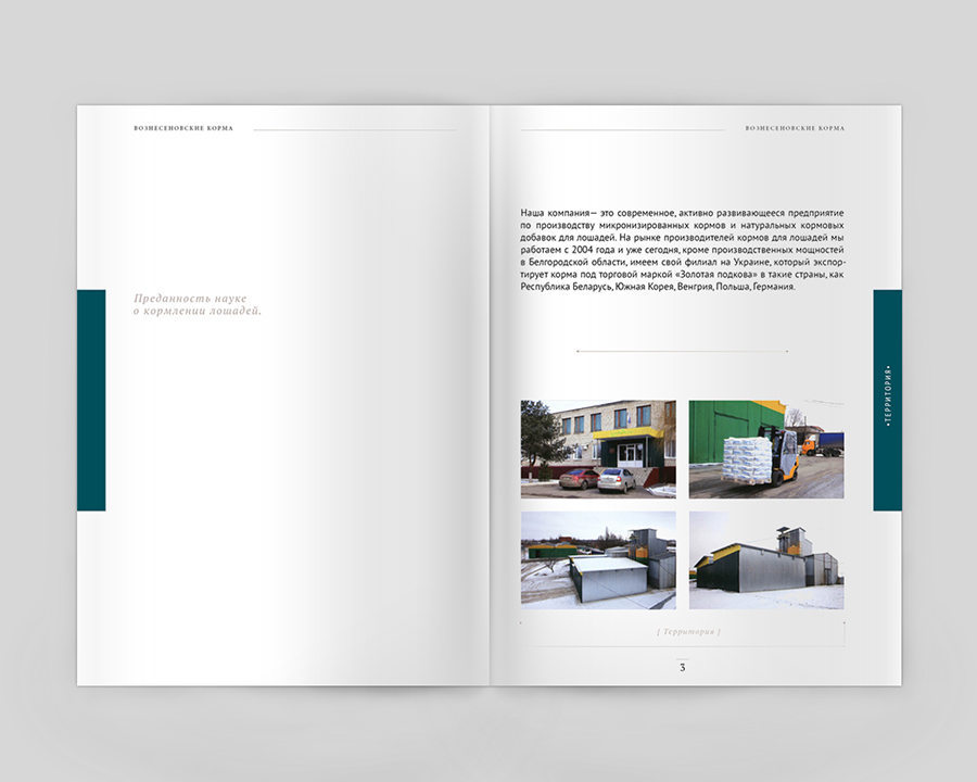
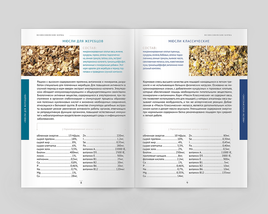
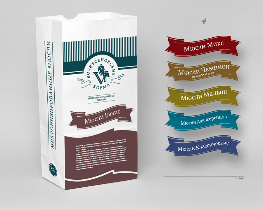
A series of color-coded feed packaging was also developed, which was produced by flexo printing, where the number of colors is limited. Two colors were used: the main one, which printed unchanged information throughout the series, and the color of a certain type of food. All packaging colors are in harmony with the corporate turquoise.
During the work, we learned that a horse can cost about one and a half million euros.


