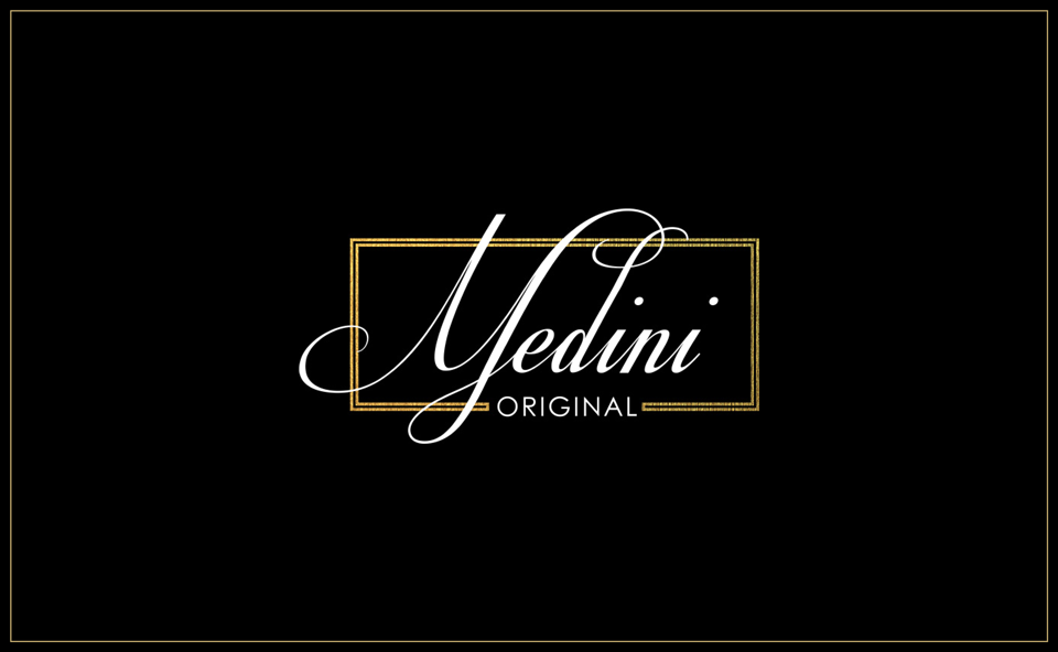
TM Medini logo
Task: development of a corporate decor for the logo of the Medini trademark

The following works were carried out:
- The strokes in the letters "M" and "d" intersect more harmoniously, in accordance with the aesthetics of baroque cursive.
- Smoother transition from letter to letter has been corrected.
- Rhythmically aligned a number of basic strokes.
- Aligned letter spacing.
- The matching strokes in the capital "M" and the strokes in the "d" have a similar calligraphic curve, which creates a graphic rhyme in the logo.

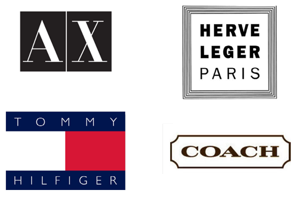
Analyzing corporate logos in the field of fashion, one can notice a tendency for the predominance of grotesque forms. A triumph of straight lines, pure geometric shapes. The dominant number of logos of the leading fashion houses are just typefaces.

Also in the logos of the fashion industry, frames are observed as a decorative element.

Identity trends of successful brands were used. Namely, the inscription "Medini" with aligned strokes and a balanced rhythm of strokes, without any openwork frills. As a decor, it is possible to use a frame, which gives the logo an exquisite rigor.

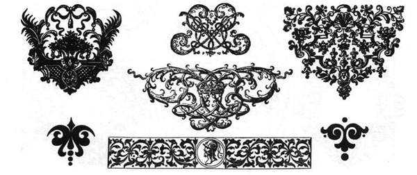
Since the logo of TM "Medini" is written in baroque italics, the floral ornament of the baroque era was taken.

The final result with the ornament currently used on the site.


