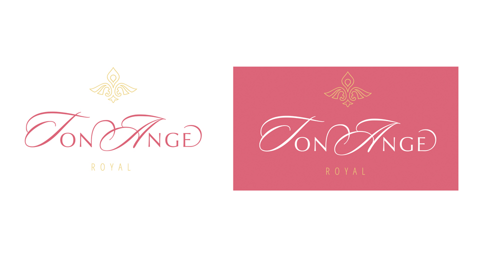
Ton Ange company logo
About the client: Ton Ange is a manufacturer of exclusive christening clothes made of expensive quality materials.
Task: creating a status and at the same time gentle logo.
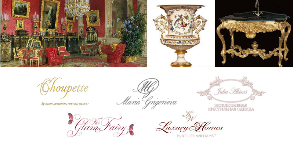
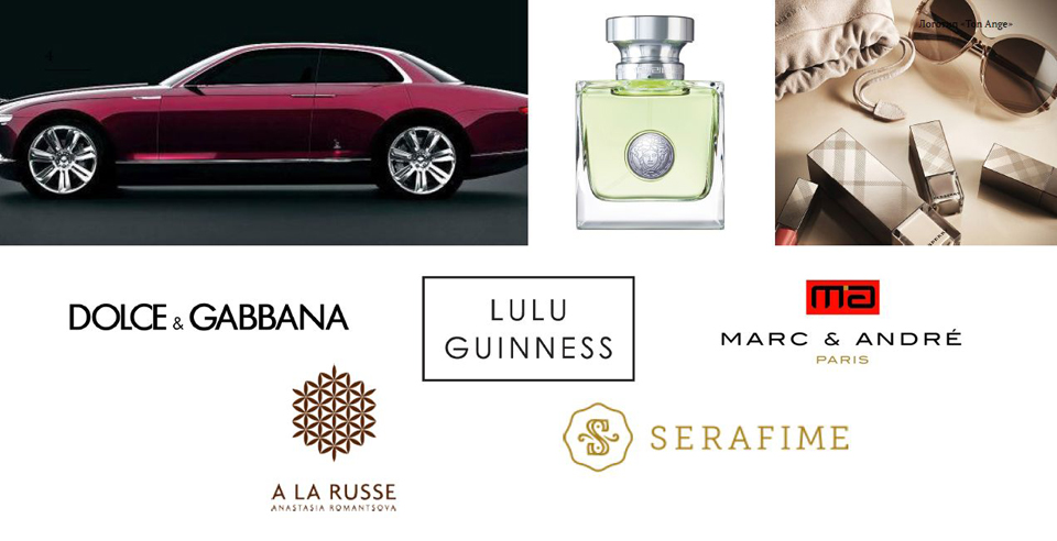
A long way to develop the ideal solution for our customers has gone through the search for visual associations and competitor analysis. Among the logos we studied, two trends were especially pronounced.
The first one appealed to the traditions of English clerical writing, to the so-called "handwritten" openwork fonts of the Baroque era with a large abundance of flourishes and decorative details. The outlines of such brand names express luxury and grace.

The second is status logos, typed mainly in capital letters using strict fonts such as antiqua or grotesque.

Keeping a balance between the pretentiousness of the Renaissance and the asceticism of modernist chic, we have received a brand name that exudes warmth and care. Capital letters give the logo the softness, sophistication and airiness characteristic of the company's products. The rest of the letters, typed in "ribbon serif", are designed to emphasize the respectability and stability of the brand. The outlines of a guardian angel and a fleur-de-lis, a symbol of majestic purity and virtue, are guessed in the logo, and the smooth curves of its shape reflect affectionate guardianship and sensitive patronage.


