⭐10 signs of a site that needs to be added to the cart✹


Are you the owner of a web resource that, for reasons you do not understand, does not make a profit? Then this material is for you.
The Internet is full of all sorts of sites. Conventionally, they can be divided into "live" and not very. I would like to dwell on the latter, since they are the ones that pull your Internet business to the very bottom of the rankings. It is the "dead", outdated sites of small things that do not stimulate sales that also harm the company's marketing.
We also recommend reading this material for those who are just planning to acquire an Internet site, so that they know what rake they should not step on. So, let's begin.
1. Colorful junk on the homepage
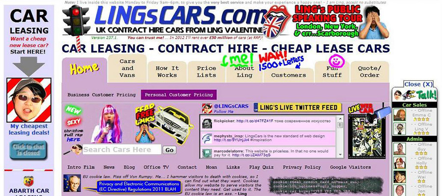
Yes Yes Yes! Even despite the fact that since the creation of the first sites, Internet design has long since stepped forward from the Era of Dinosaurs, you can often find sites with a bunch of multi-colored blocks, photos and links, a lot of bright graphic elements on the main page.
Our advice:
Go through once again all the "wealth" of the main page. Most likely, most of the promo blocks, links and flashing multi-colored banners should be removed, as they litter the site and distract attention from its main idea.
2. Outdated clipart

And this fact is in place. Photos from the same era of the creation of the first sites: men and women in business suits with sparkling snow-white smiles. Photos dug up somewhere from clipart dumps should not be. To date, there are a lot of relatively inexpensive photography services that you can use and purchase high-quality, unique and quite modern photos.
Our advice:
Do not be greedy and fork out for photo services in the name of developing an Internet business, which will then return your costs a hundredfold. If there is absolutely no money at all, then try to find free photos on the Internet that are as close to reality as possible.
3. Broken links
This happens even on "well-groomed" sites: once a link was posted, but for some reason the link stopped working. The page may have been moved or removed.
Our advice:
Do not be too lazy to go through the pages of the site and click on the links, thus checking their performance. If there is no time or there are a lot of links, use the services for webmasters from Yandex or Google. They will help to identify all broken links in seconds.
4. Contact information

It is unlikely to inspire confidence with a single email address paired with a phone number without specifying any contact persons on the contact page. This is a typical picture for sites of the early 90s, but not modern ones! Do you want to inspire confidence? Read below.
Our advice:
Identify a couple of key people in the company, indicate their full names, positions and regalia, phone numbers and e-mail. This will make it clear to the person that he trusts his money to a very real company with “live” people, and not to the company “Horns and Hooves”, which in which case you will not find it in the afternoon with fire.
5. Self-starting audio and video support

Imagine the situation: late in the evening, when everyone is resting, you decide to sit at the computer in search of the necessary information. You open the site, and from there bursts the heartbreaking musical or video accompaniment of Bilan or Leps. I think that the family that woke up in a fright will not thank you for the soulful music. What do you think your next step will be? No, do not turn off the sound, but click on the red cross in the upper right corner of the monitor.
Our advice:
Let the user decide for himself whether he wants to watch videos and surf the site accompanied by music. Make it optional to start audio and video.
6. Statistics counters
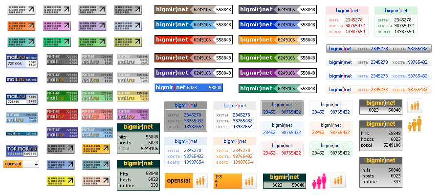
Spylogs and visitor counters are long-dead elements of Internet sites. At least they slow down the loading of the site. Get rid of them. If you still have an irresistible desire to show off your own statistics, leave such gizmos as little as possible.
Our advice:
After making sure that there are no statistics counters in the user's field of vision, also make sure that there are no hidden scripts and counter codes left in the page code. If you can’t do it yourself, contact a specialist you know.
7. Separate text from pictures

Texts on the site should be inserted as texts, not as pictures. Texts in pictures may not be displayed correctly by browsers. Also, they are not read by search engines. If you don't know for sure how it was inserted, check this way: zoom in on the questionable page and, if pixels are visible, then the text was inserted as an image. If the quality does not change, everything is OK, the text is inserted correctly.
Our advice:
If you find that important information about your company is entered inappropriately, puzzle the layout programmer to separate the text from the pictures.
8. Traces of "black" optimization
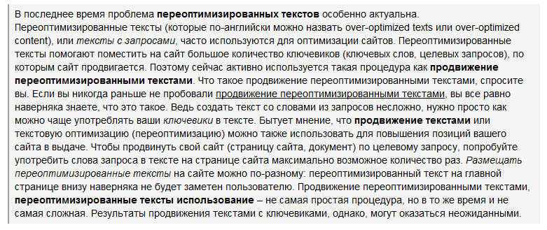
Whether due to inexperience, or due to their stubbornness, some optimizers still place texts like: “Do you want to buy fashionable clothes in Kyiv inexpensively? Then contact the best online clothing store in Kyiv inexpensively. We are ready to provide you with a wide range of clothes in Kyiv at an affordable price” and so on in the same vein. It is important to understand that texts of this kind - over-optimized and annoying to the user - do not work for a long time, neither for search engines, nor for the user. Key phrases should be "woven" into sentences naturally. You can't overdo it with them.
Our advice:
Work hard yourself, and if it doesn’t work out, entrust the writing of a unique, easy-to-read text to an experienced copywriter.
9. Three-dimensional men

Please do not use this faceless, mindless horror on the pages of the site. Just don't.
Our advice:
Three-dimensional men in the scrap!
10. Flash animation
Do not use Flash-animation on site pages. Believe me, there is nothing worse looking than a flashing "header" of an online store or corporate website. In addition, flash screensavers may not work on some devices (for example, gadgets from Apple). They are also not indexed and can slow down the loading of the site. As a last resort, Flash blocks may be appropriate if, for example, you need to inform about a promotion or discount. No more.
Our advice:
Review the site. Find the strength to refuse flashing blocks on the site. Contact a specialist. An intelligent web designer can easily replace all this “beauty” with equally beautiful blocks, only without blinking elements.
If you want your Internet resource to be competitive in its direction, then make every effort so that none of the above points is marked with a plus sign during the audit of your site by competitors.