10+ Usability Mistakes That Lose Website Revenue

Often our studio is approached with the sacramental question “why are there no orders on the site?” The answer usually lies on the surface, it's all about usability flaws.
1. Non-standard functional elements
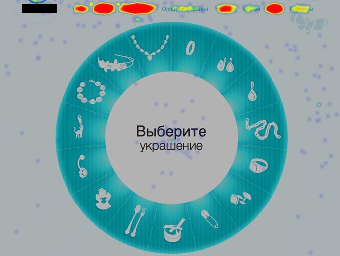
A vivid example is an unusual catalog in the form of a circle on the main page of the site. We do not argue that this is original, but inconvenient, especially since the link in the menu allows you to go to a similar section with a standard design. The shape of the circle is partly the leitmotif of the company's corporate identity, but this is no reason to endow the decorative element with applied properties.

On the click map presented above, it is clearly seen that users prefer navigation through the top menu of the site. Visitors, in most cases, ignore the "wheel" because they do not understand its purpose. In addition, a large number of clicks are on the central block, the phrase "Select a decoration", although the text is not a link.
2. Inconvenient site navigation
Classic mistakes that will lead to the loss of a potential client:
- no "breadcrumbs" (indicating the user's location on the site);
- small clickable elements;
- lack of an informative 404 page .
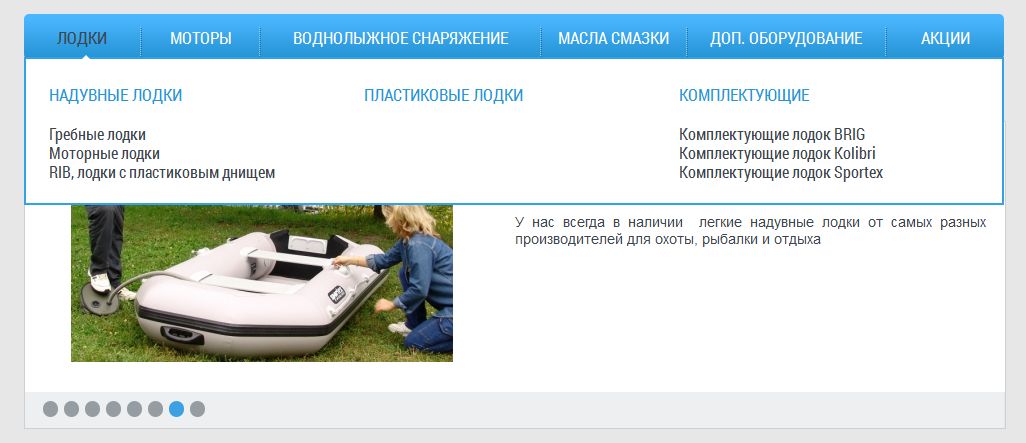
The horizontal menu, a relic of the last century, is unfortunately still used in website building. The user needs to move the mouse cursor diagonally from the section name to the link to the required subsection. Not everyone will be able to successfully complete such a rather inconvenient operation the first time. Such a menu can cause nothing but irritation.

3. Unreadable text
The text should not only be well-written, but also not strain the already tired eyesight of the user.
Just remember that this is not good:
- excessive contrast between font and background;
- difficult to read font;
- "sheets" of text without headings, with long paragraphs;
- narrow area for placing text content;
- articles divided into several pages.
4. Failed product page
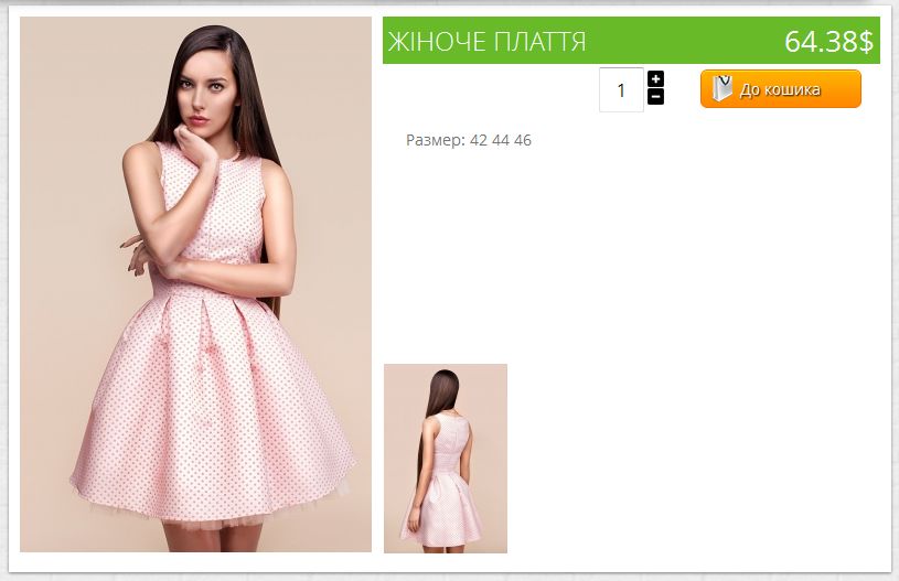
On many sites, you can still find product pages with poor quality images and outdated functionality, no list of viewed or recommended products, and inconvenient navigation. Almost every person who has been using the Internet for more than a year has ordered something online. It's nice when everything and even a little more is written about the product. Unfortunately, many site owners forget about this.

5. Dead links
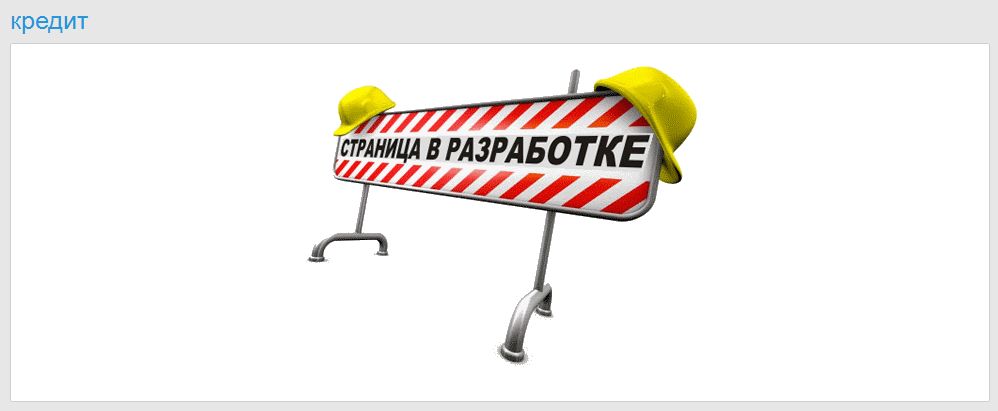
It's not so bad if the user could not follow the link to the article about the product, but it happens that the site does not have entire sections, for example, information about buying goods on credit. A site with blank pages gives the impression of an abandoned resource, which negatively affects the image of the company as a whole.

6. Puzzle elements
Not everyone likes riddles, especially if it is impossible to find an answer to them for a mere mortal. We are used to the fact that there is a shopping cart in the upper right corner of the online store, but it will still not be superfluous to sign it.

Further in the same cart, the user makes an important decision for him to change his current status from an idle visitor to a client. He carefully weighs the pros and cons and decides to remove one of the products, but no luck. The “Delete” button cannot be found during the day with fire, but there is its analogue with the illogical inscription “Accept changes”, but this still needs to be guessed and verified empirically.

The same story with the search, it must be and work on multi-page sites with a large assortment of products. The faster the visitor finds the desired product, the faster he will buy it.
7. Registration difficulties
Registration forms with an endless list of mandatory fields make life difficult for both site managers and site visitors. The user should have an alternative - the ability to order a product without registration, especially if it is a retail and inexpensive product.
Pay special attention to the fields with contact information. In addition to checking the spelling of the email address, the cell phone number field must be character-limited to ensure that incorrect data cannot be entered. Otherwise, managers will not be able to contact the buyer and lose contacts of a potential client.

8. Difficulties in placing an order
Ideally, the buyer should be able to track the readiness of the order in his personal account, but it is unacceptable to leave a potential client in the dark on sites that are less functional.
After making a purchase, the site visitor waits for an action confirming a successful transaction.
An elementary pop-up window with the text: “Thank you for your purchase” will be enough, and if you add information about the delivery time of the goods there or: “Our managers will contact you within a day”, it’s generally excellent.
9. Inaccurate Brand Positioning Information
The scope of the company's activities should be clearly stated on the website. In addition to the text in the relevant section, you can and should place basic information on the main page - in a header or slider. It makes no sense for a wholesaler to hide his true face, otherwise the percentage of failures will grow by leaps and bounds, and target buyers will unknowingly bypass him.
10. Slowness
Pages take longer than 4 seconds to load? Bad, very bad. The client will not wait, but will go over to more nimble competitors.
When designing a site, profess the principle: a minimum of clicks to achieve the goal.
Focus on users who are not familiar with the features of the Internet. Even our grandmothers are already actively using the possibilities of the network, but at the same time it is much more difficult for them to understand all the intricacies of using a web resource. Speak with site visitors in a simple and understandable language, and they will turn into your customers with pleasure and without much difficulty.
