15 terms you need to know to easily communicate with a web designer
 If your job is somehow connected with communication with web designers, you just need to know the basic 15 terms in order to speak the same language with them. So, let's start studying the basic terms and concepts that you can meet on thematic forums and blogs.
Vector graphics
 Vector graphics are visual elements that are made up of geometric shapes. The advantage of vector graphics over raster graphics is that they are easier when working with large images.
To understand the difference, note that:
- Raster graphics are an array of colored pixels; information is stored for each of them.
- Vector graphics are an array of graphic primitives that are described by mathematical formulas.
For example, if you want to draw a line on the screen, all you need to know is its color, the coordinates of the beginning of the line and its end. To build any shape, such as a square or a triangle, you need to know the coordinates of the vertices, the color of the stroke and fill. Most often, vector graphics are used in the creation of icons and logos, as well as in the design of infographics.
Raster graphics
 We talked about bitmapped graphics above. It remains only to add that the images in which it is used depend on the screen resolution. If the picture needs to be greatly enlarged, then all the points that make up the image will be visible. And by the way, each photo is a bitmap.
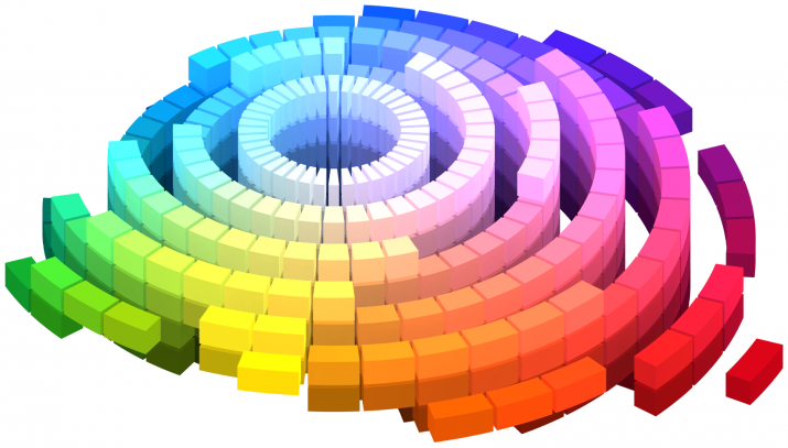
Four-color CMYK palette
The abbreviation CMYK is nothing more than the names of colors: Cyan, Magenta, Yellow, Key color, where:
- Cyan - blue.
- Magenta - magenta.
- Yellow - yellow.
- Key color - black.
This palette is considered the most popular and commonly used in print.
It is believed that the color of a computer screen changes from black (ie, the complete absence of color) to white (meaning the most vivid combination of blue, red and green). On paper, the opposite is true: white is the absence of any color, and black is perceived as a mixture of the maximum number of colors. That is why, before sending the images to print, they are transferred from the additive (RGB) to the subtractive color model (CMYK).
RGB palette
Stands for Red, Green, Blue (red, green blue). This is the most common color model. This palette is used by computer monitors. That is why web designers use the RGB palette as the main one.
Adaptive design
 Adaptive or Responsive design will ensure a good perception of the site pages on any device and at any screen resolution. This means that wherever a site with an adaptive design is opened (phone, computer, tablet, laptop), it will be convenient to view and use everywhere.
flat design
Flat or Flat design is based on functionality and simplicity. This is the basis of a graph: simple buttons, shapes, icons and bright colors. Flat design elements, as you already understand, do not have volume and depth. That is, gradients, textures, highlights, shadows that can give the object naturalness are not applied here.
Skeuomorphism
Skeuomorphism (or Skeuomorph) is based on the principle of borrowing the appearance of existing prototypes and design elements. Steve Jobs once pointed out that skeuomorphism is ideal for realizing your own ambitions: you need to make using any device as simple as possible. It should be so simple that any person who has not previously used Apple devices can intuitively understand what works and how.
Metro interface
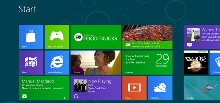 Also known as Microsoft's design language. Used in most Microsoft products. Based on Swiss style design. The Metro style has great typography and large text that immediately catches the eye. The creators of Metro were inspired by road signs. The developers wished to make everything just as simple and clear. The main thing, they considered, is not to perceive design as a work of art, but as a workspace.
Tile
 Style Tiles became popular after the success of the Pinterest network. The style of tiles is based on the structure of the columns. The material feed is parallel, but not symmetrical, in the form of tiles. Outwardly, it looks like a set of different-sized squares. At the same time, everything is built very clearly and neatly.
Upper half of the strip
In the original it sounds like Above the fold. An important term for those who work with platforms online. This expression is taken from old-fashioned newspapers, where the main news was placed just in the upper half of the page. So they were the most visible. In web design, the “top half” refers to the part of the screen that is visible to the user without scrolling.
long scroll
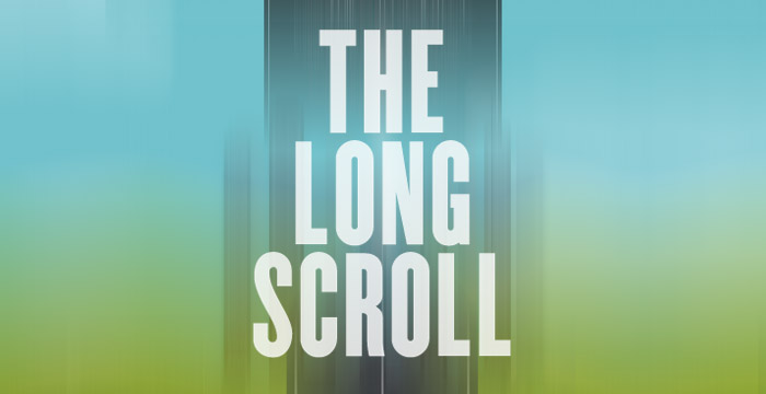 Long scrolling is one of the trends in web design. Here the name speaks for itself. Long scrolling means scrolling down the page for a long time. This is especially evident on the pages of social networks. They are distinguished by long news feeds that can be scrolled endlessly.
“White Spots” or “Negative Space”
This term refers to white space between page elements. Simply put, it is a space not occupied by content. “Negative space” can be a design highlight. With the right combination, “negative” will easily support “positive space”. The main thing is that it does not distract attention from the main idea of the site.
Textures
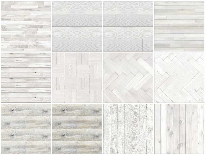 Used to convey the depth of the design. Here, subtle, simple textures can be used to add subtlety to the design, or more complex ones that are used by designers in menus and headings.
Mockup
This means a model that demonstrates your future site. The difference between the layout and the real site is that the first one does not function.
Promo website
A site, most often having one page, which will contain all the important information. It may seem that this is the easiest version of the website. But this is absolutely not the case. Just think about how difficult it is to place all the important information on one page without overloading it and focusing the user's attention on the main idea of the site.