5 Common Landing Page Mistakes

Creating landing pages - quick-to-build, one-page sites - is now very common. They are not made only by the lazy, and even then, not a fact. But the success of an aesthetically pleasing landing page fades when conversions are calculated. There are many similar creations on the Internet with the same errors. Let's take a look at the most common of them.
1. Poor page structure
The role of a landing page is simple: make the visitor your customer. Landing involves collecting data to a minimum - an email address and some data. And that's all! On some sites, a real media center is built with pictures, videos, links and the like. Seeing such a picture, a person does not understand what he needs to do first of all, which button to press.
Our advice: the essence of the offer and call to action should be on the first screen. A person does not have to scroll through all the screens to find the treasured button.
2. Poor quality graphics

As a rule, there are two problems: incomprehensible pictures torn from a photo stock and heavy pictures. As for the incomprehensible - here we mean images in the entire first screen, completely unrelated to what the site offers. Believe me, users have not been pleased with just beautiful images for a long time with no one knows who does no one knows what. The picture should at least be associated with what you want to offer the client.
With heavyweight pictures, everything seems to be clear. The heavier the image, the slower the page loads and the less likely it is that a person will wait until the end of the download.
Our advice: Firstly, the picture should reflect the essence of your proposal, and if you do not have a suitable one, order illustrations. Secondly, do not forget about optimization. Many users will be browsing your site on mobile gadgets and trust me, they won't even wait a minute for the download to complete.
3. Communication style
To reach the user, you need to communicate with him in the same language. If your audience is young people, then you can immediately switch to “you”, communicate freely and not bother. If your audience is older people, then communication should be appropriate: only on “you” and respectfully, not allowing yourself any liberties.
Our advice: if the age range of the audience is still unclear, use "you" - you can't go wrong. By doing so, show respect, regardless of their age.
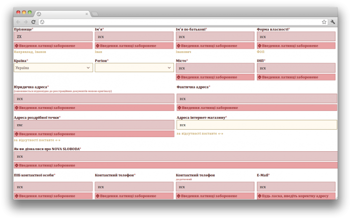
4. Intricate registration forms

The simpler and simpler the registration form, the better for the user and for you, respectively. Ideally, one field is enough - for the user's email.
Our advice: the simpler the better. If the form involves a lot of questions, break it down into several steps.
5. An empty call to action

The main element of the landing page is the coveted “order” or “buy” button (well, or something else that you want to offer the user). He has already scrolled through all the pages, read and appreciated the full benefit of the proposal. It remains only to gently point him to the call to action button. Oddly enough, it doesn't work for everyone. Why? Yes, because there is no clearly marked call to action button. Only stupid phrases like “Would you like to start registration?” catch your eye? or "Start today." In general, what to do, a person does not understand.
Tip: the call button should always have a verb (“order”, “subscribe”, “buy”). Can be supplemented with an adjective or adverb, such as "download for free", "order now", etc.
And a few more tips for a good landing
Page structure . Try to squeeze into a couple of sentences the essence of what you are going to do: sell something, register, take an email address. Describe the benefits of your product clearly and concisely.
Write text . Make it as useful as possible. Less epithets, more specifics.
Make sure there is a call to action . And also that it is understandable and contains a verb.
Align text and structure. This can be done in text or diagrammatically.
Don't just rely on your taste. Let others see the draft. Let them evaluate how understandable it is, what associations and desires it evokes. Do you want to register or leave mail on such a page?
Start with the mobile version. If you get a successful mobile version of the landing page, then it will not be difficult to make it desktop. The other way around (from the full version to the mobile version) is often more difficult.
Correct illustrations. Don't get carried away with photo stocks. It is better to hire an illustrator or get by with screenshots.
If there is a form after the call to action , make it as short as possible. Enough 1-2 fields. And do not forget about authorization through social networks.
Adaptive layout. Check the performance of the landing page on different devices, with different operating systems.
Install support chat. It is able to increase conversion and make the page shorter. The user can write himself in case of questions.
