7 important features of the main page
The cornerstone of the site is the home page. Design development begins with it, you need to “dance” from it when creating all other sections, users keep returning to it to search for information of interest and so as not to “get lost”. Clear, comfortable, attractive - this is how visitors and owners want to see it, but to achieve the cherished goal, you will have to work hard.
1. Design
Yes, yes, as always, it all starts with the design. By design, most users meet the site, instantly imbued with sympathy or antipathy for the resource. The resource will be able to intrigue and keep them on its pages with a skillful combination of modern functionality and design trends.
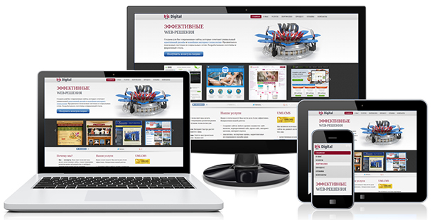
- Adaptive layout . A website that is readable on any device is a great advantage and a guarantee of reaching the maximum percentage of the target audience. The development of adaptives will require special skill and ingenuity from designers. It is necessary that the resource be convenient and remain recognizable even on a small smartphone screen.
- visual blocks . Searching is much easier if everything is in its place. The menu, the main categories of the catalog, site search, text, media content - everything should be freely located on the main page without piling up accents.
- Large high quality images and videos. A product presented by a “face” and from different angles - what can more effectively increase sales? Bright photographs will complement, and sometimes even make up for, what the text failed to “say”. Many experts recommend adding photographs of people to websites where appropriate. Naturally, in an online store that sells clothes, there will be enough images of models demonstrating goods. The advice is more useful to sellers of household appliances, building materials and other products in the same vein. Photos of people can be placed in a slider with a product, in category banners, in the section with delivery, as an image of an online communication operator. One, maximum two skillfully placed beautiful happy faces are enough for the site to stop being emotionally boring.
2. Navigation
Forcing a user to complete a lead is a fix idea of any webmaster. No one needs to be trained, it is enough to design the resource so that the visitor can easily find the necessary section or product. Simple and clear navigation will help him a lot in this difficult mission.
The most difficult thing is to create a convenient and efficient configuration for an online store. Navigation on the main page in this case can be of three types.
- By goods . The user is immediately offered top products, the most in demand and popular. Most often, this type of navigation can be found on the websites of product manufacturers.
- By category . For a resource with a large assortment (suppliers of products of various brands), placing various categories on the start page is suitable. When a visitor is not familiar with the assortment or has not yet looked at a specific product model, he can look into the appropriate section. For those who have already decided on the proposed purchase, a noticeable, well-tuned search with hints must be provided.
- Mixed . To increase the effectiveness of the site, you can use a hybrid of the types of navigation described above. For example, show new or promotional products, but do not completely shift the focus from the categories.
3. SEO
Let's repeat our favorite mantra: "title, keywords, description". Meta tags on the main page should be written in accordance with the selected semantic core.
High ranking of the site's start page is unthinkable without seo-text of at least 2000 characters, with keywords carefully calibrated and skillfully entered into it.
4. Competitive advantage
We will not delve into the wilds of pricing and competitor analysis, this should be done even before the creation of the resource. Let's talk about the benefits that a site visitor should notice and appreciate.
All elements and content of the main page should work to create a positive image of the company from the first seconds of meeting the user and the resource.
- Attractive headings and meaningful subheadings - they determine whether the user will extend their stay on the site. "Set the tone" for all the content of the resource with a spectacular headline, which will reflect the activities of the company. In the subheadings, indicate the main advantages and distinctive features of the company and/or the products offered.
- Calls to action and call to action buttons should easily and unobtrusively, but confidently and accurately lead the user to the required action.
- Achievements, awards, experience, diplomas and certificates testify to the professionalism of the company and the high quality of goods or services. Together with examples of work and reviews from real clients, they significantly increase the confidence of potential clients. Where can you boast of all this, if not on the main page :) ?
5. Content

Diverse homepage content (articles, press releases, reviews, videos, pictures, etc.) should solve user problems and clearly answer their questions. Dry calculations, insipid and unsupported by real digital facts praises to the company are of no interest to anyone. Content should meet the purpose of the site and interact with the visitor.
It will not be superfluous to place a short but capacious text about the brand and the product offered on the start page. Difficult technical points are best illustrated and an accessible description of the work processes added.
6. Promotions

Discounts, prizes, special offers, loyalty programs for new and regular customers - there is no better place than the main page for one of these promotions. Information about such bonuses must be noticeable and tempting.
7. Contacts

The most annoying thing is to lose customers because of trivial things, for example, contact information that is hard to find and easy to lose :) It is advisable to place the main communication channels in the upper right corner of the page, these can be phone numbers, skype or branch addresses. We should not ignore such powerful Internet marketing tools as e-mail newsletters and social networking widgets that allow you to establish long-term communications with consumers.
Visitors need to be groomed, nurtured and provided with maximum options for applying:
- feedback forms for sending user contact information;
- the ability to quickly place an order on the site;
- online consultant;
- back call.
The list, of course, can be continued. We've covered the fundamental elements of a conversion-successful homepage. We hope they will help you grow your business and increase your profits from online sales.
