7 sins of a web designer

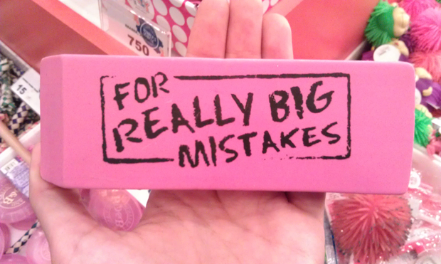
Who among us does not make mistakes? Everyone is sinful, designers are no exception. We are not throwing the first stone in the garden of ignorance, there are already a lot of weeds, but just highlighting a few of the most common mistakes web designers make. You look, these remarks will guide someone on the right path.
1. Give me pills for greed, but more!
The notion that the use of a huge number of colors and a variety of fonts supposedly gives a site chic is still rooted in the minds of web design epigones. In fact, two or three colors in tandem with the same number of fonts will be enough to develop a quality product.
2. Designers are introverts
Users are self-sufficient people and do not want to be forced to register or open links in a new browser window by default. Most of all, users are upset when a person who is closed, focused on his inner world and his own passions, unable to establish contact with the surrounding reality, was involved in the design of the site. Such individuals usually do not notice that the monitor resolution of mere mortals may not be 1920 × 1080, but 1024 × 768, that people around can use the Safari browser and even Internet Explorer, not to mention the variety of mobile devices.
3. Commercial break
Unjustified use of aggressive animations and pop-ups will inevitably make users itchy and runny. Allergies to advertisements, with which all this is associated, cannot be cured. So why provoke an exacerbation of a chronic disease?
4. Archaic bonuses
Unbelievable, but true: vintage lovers are still carefully blowing away centuries of dust from tickers, flashing fonts, acid colors and background music for the site, and then transfer all this “beauty” to web pages with trepidation. Such tricks were considered original and fashionable in the dashing nineties, but it's time to come to terms with the fact that the time of these "dinosaurs" has irretrievably sunk into oblivion.

5. Moveton
The rules of etiquette, they are the rules of etiquette in Africa, do not forget about them, otherwise in some of the exotic countries of the Black Continent you may be eaten for non-compliance with unwritten laws. In any field of activity, including design, there are canons. You don't have to follow them blindly, but you shouldn't forget them either. For example, it is strongly discouraged to underline text unless it is a link. Akin to champing at the table - the inept mixing of sans-serif and serif type (sans and serif). In orderly rows of intervals, there should be no confusion and wobbles, when one indent is 10 pixels, and the other is 40. An important role in the perception of the site is also played by the correct choice of font design (size, line height, readability, color) and alignment (proper use frames and grids). Remember also that following one style of design is not a manifestation of the crisis of the genre, but rather a sign of solidity and consistency.
6. Client? No, have not heard.
There is no sadder story in the world than a misunderstanding between a designer and a customer. The client is always right (no matter how trite this phrase sounds), he needs to be groomed and cherished, heard and listened to. Developers and designers must easily ingratiate themselves with the customer, ask him a million clarifying and leading questions, and sometimes even have psychic abilities in order to find out from the client all his wishes and whims, and only then can you count on manna from heaven in the form of a successful project.

7. Unjustified ambitions
You can’t sacrifice usability in favor of visual appeal, for example, you can easily overdo it with powerful visual effects and tricky navigation, while forgetting about the elements that are more important for site visitors: convenient search and understandable data entry forms. This also includes the pursuit of flash-elements, their use must be strictly justified by an urgent need, and not by a fleeting whim of the customer.
The list of mistakes can be endless, they are big and small, gross or forgivable, there are also those thanks to which you can already mentally prepare for imprisonment in the ninth circle of Hell. The main thing is not to forget about one very important commandment - love for your neighbor, more precisely for users. Orientation to the needs of the visitors of the resource in the blink of an eye will remove blinders from the eyes, increase the appetite for extraordinary ideas, and give enlightenment in understanding the clear idea of the future site.
