8 + 4 usability tips

Any site should be clear and convenient. Successful resources with maximum conversion are, first of all, logical, simple and pleasant to use. Achieving high usability rates is often hindered by small but common flaws on the site, and we propose to fix them.
Fixing common usability errors
We have previously touched on the issue of usability errors , but now we are devoting a separate post to this extensive topic. To improve usability indicators, increase conversion, user comfort, and clear karma, the following points should be avoided.
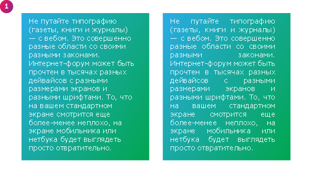
Text justification. Looks attractive but hard to read.
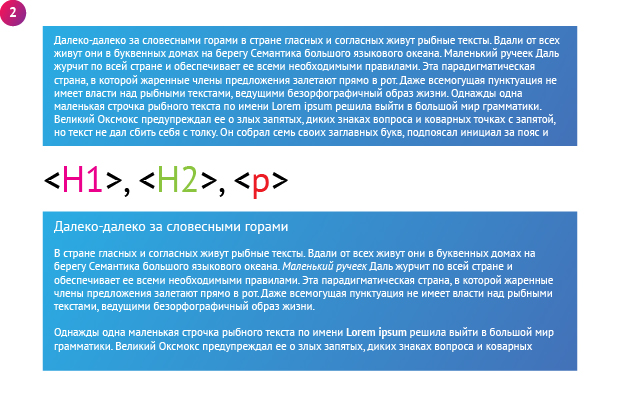
Long paragraphs. Nobody likes to read huge texts without division into paragraphs, especially if the information is complex and concentrated. Don't forget about indents, split the text (within reason) into smaller parts.
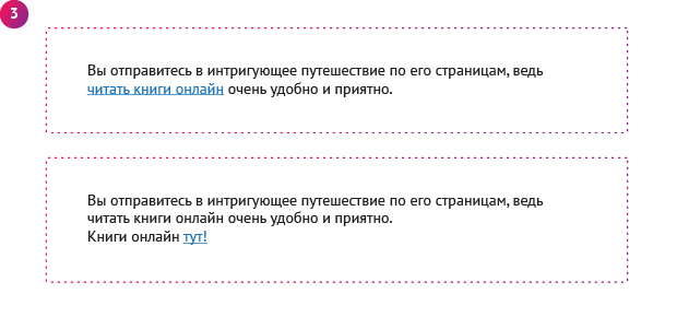
Please click "here", "here" and "there". Save time for your site visitor, do not make him reread sentences and paragraphs of text to understand whether he wants to go “there” or not. Use the descriptions in the link itself. For example: “An article about errors in site usability”, “Infographics about site usability”, “Download the archive with the book of I.I. Ivanova".
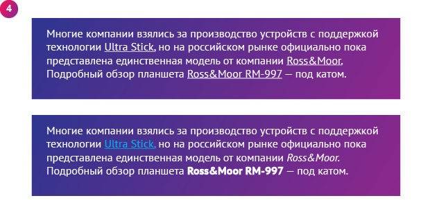
Underline text that is not a link. This has already been discussed and discussed, but there are still precedents. We will not explain for the thousandth time why this is bad and inconvenient. Just don't do it.
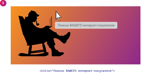
Images with empty alt and title meta tags. There are several reasons to fill in the column with the description of the image. Firstly, it is good for SEO and can bring additional traffic to the site, and secondly, it simply explains what is shown in the photo. A picture can also be a link at the same time, in which case it is quite logical to indicate where it leads.
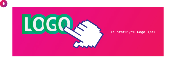
The logo in the site header is not a link to the main page. But in vain! Users are accustomed to this convenient and simple rule, do not deprive them of the ability to quickly navigate the site.

The background image does not have a background color. This fact may turn out to be an unpleasant incident for those who like to turn off images in the browser settings. Give preference to a background color close to the color of the picture.

No reaction when hovering over active elements. The user does not have to guess what can and should be clicked on. Active elements should be displayed adequately on hover.
Web form usability bugs
The most important component of the success of any business is the high quality of service. For online stores, this is almost the only way to win in the competition. Naturally, no one canceled the quality and uniqueness of the goods (services), as well as the convenience of the site as a whole, but in order to maximize comfort and increase user confidence, first of all, it is necessary to work on improving customer service. One of its elements is online order forms (applications). It is quite possible that a significant part of potential buyers leaves you for competitors due to errors in web forms and application methods:
- Unselected active field. When filling out a particular column in the order form, it is convenient to know where the text is currently being entered. A moderately contrasting background or frame helps in this case.
- The calculator does not calculate the cost immediately. The user is interested in buying a service or product and probably compares prices on different sites. He presses the keys hard, considers the options, selects the necessary equipment, but there is no final amount. You can find out the results of calculations only after specifying contact details, name, e-mail, dancing with a tambourine, and so on. When the calculations are really very complex and highly individual, it is better to replace the calculator with a feedback form with a price request, or else (if the calculator on the site is so dear to your heart) give out the amount immediately, but marked “approximate cost”.
- Slow feedback. Reaction speed is important not only in boxing, but also in online business. It's all about competition. If you don't have time, the "neighboring" online stores will. Ideally, confirmation of applications should be carried out by phone, as it is more reliable and familiar to users.
- Many questions. We have already said, but, so be it, we will repeat that for placing an order, the optimal number of points to fill out is no more than 5. Today we will mention unnecessary questions in the feedback forms with applications for calculating the cost and the cautious attitude of users to sending personal data on the Internet. The site visitor will think twice even before sending his email address, he is reluctant to rake up the "heaps" of spam later. Full name, home address and other confidential information is correct to be interested only at the time of order delivery. In the feedback forms, do not ask questions like: “how did you hear about the site?”, “What products would you like to see in our assortment?”. You can ask about this later, after the sale of the product, when such questions will annoy the client less.
Follow our advice, avoid usability mistakes, and your site will work effectively.
