A/B tests for mobile sites: 10 simple solutions to one problem


Mobile gadget users provide 55% of traffic, but only 26% of purchases. This happens for an obvious reason: most resource owners do not adapt their pages specifically for the mobile Internet, which means that when using them on smartphones and tablets, there are difficulties.
Basic improvements

No matter how you modify your resource for mobile devices, remember the basic principles:
- Minimalism and rigor. Keep in mind that mobile screens are small. Bulky elements or excessive variegation will distract users on the way to the goal.
- Small selection. So it is easier to decide - this rule always works.
- Page loading speed is fast, no compromises. The owner of a smartphone has little time, even less than the owner of a netbook. It won't wait for the page to load - 100%.
How to Increase Conversion Using Simple Methods: Testing Changes Easily

So, we offer you 10 simple changes that allow your resource to become closer to mobile users.
Products on the main page. You should not scream about your anniversary or post photos of happy customers “from the doorway”. They came to you for a product, so start selling from the first page. The user will read the history of the company later - when he comes to you again, satisfied with the first order. Of course, only bestsellers deserve to be on the first page.
Order in one click. The more fields and the graph the user fills in on his way to the product, the higher his desire to evaporate (that is, change his mind about buying). Think - is it so important to you that the user first register an account? After all, the main thing is the sale, and not another e-mail in the list of addresses. You can create a single page with jQuery - one where multiple tabs will be visible at once, creating a "path" for the user. Or, place all the steps needed to make a purchase on one page. Such changes can increase page conversion by 25% on average.
The number of input fields - cut.
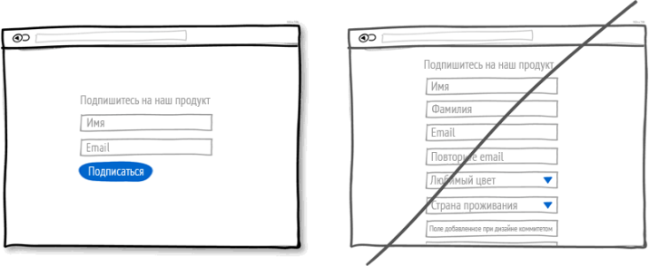
When placing an order, it is important that the user fills in as few fields as possible. This is very important for mobile devices. Remove all the information that you do not need to sell - from the physical address to the date of birth of the client. Most users are impressed that the order can be made without registration.
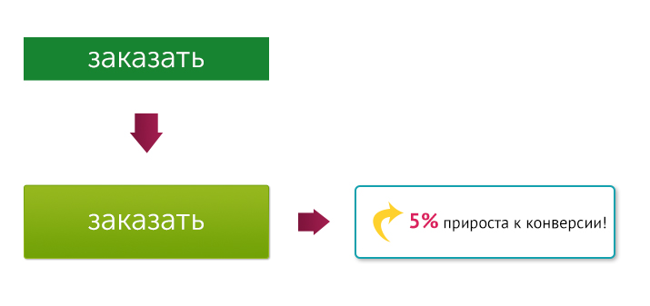
The speed of ordering is high or even higher. If a smartphone user decides to purchase something, most likely he will want to do it immediately. Therefore, “one-click checkout” is exactly what he needs. Simply replacing a button increases click-through rates by 17% on average.
Call to action - remove. We are talking about the button: if on the “computer” version there can even be several of them, then on the mobile one it is quite possible to do without them. More precisely, choose only what is critical for the resource. For example, it is not always convenient to put a like from a smartphone, as well as filling out an e-mail field. The main thing is the purchase, which means that we leave the “order” button. And when the client has already made an order, he should be offered a subscription and the creation of a client account.
The CTA button is large and prominent.
If the "order" button is not visible or it is not clickable, then the order will not be placed. Do not expect huge results from this change - a maximum of 5% increase in conversions. But this is a concern for users - and for their profits, of course. After all, if you do not click the order button, how then to make a purchase?
The choice is to limit. Endless scrolling does not attract users. Therefore, leave only TOP positions on the page, those that are definitely attractive to your visitors. The rest can be hidden behind the "show all" button.
Navigation is simplified.

Many products will not fit on the screen of a smartphone. Therefore, the list of suggestions can be reduced by allowing users to discover additional categories on their own. Another option is to break the navigation into steps by adding subsections. For example: men's wardrobe - shoes - sneakers and so on. So the user quickly finds the required section and does not lose connection with the resource.
The search bar is visible. Make sure that the user can easily find the desired product using the search bar. It is better to place it at the top of the menu - in the center, left or right.
Image size is reduced. Large images load slowly. So if you don't want to leave the user alone with a dangling screen, reduce the "weight" of pictures. Checking the effectiveness of the changes is simple - conduct a split test.
And do not forget the main principle of mobile devices - everything should be fast here. Therefore, you can ruthlessly cut and cut. And of course, then test.