Call to action and buttons you want to click on

Any site should sell. When working on design and usability, you should not forget about the so-called “call to action”, because it should be not only noticeable, understandable, but also effective. We will tell you how to introduce selling elements into the site structure so that they are in harmony with the overall concept of the resource and increase conversion.
What can be considered a call to action?
Elements of "call to action" (CTA) attract the attention of the user and pursue specific goals - to get a lead from the site visitor. In other words, the user, having seen a call to action, should easily guess what is required of him: download the price list, register on the site or place an order... The goals may be different, but the principle of operation of the call to action elements is the same.
Auxiliary components of a call to action:
- video;
- illustrations;
- clear and simple feedback forms;
- concise texts.
Content, telling about the advantages of the company, does the main job of attracting customers, thereby increasing the likelihood of clicking on the button at times. Nevertheless, it is the buttons that directly call to action and, most importantly, the text on them .
Let's say your site has an "Order" button, in itself it is not yet a call to action, in any case, this call is weakly argued. CTA is not only a button, but primarily an inscription on it. It would seem that we add a button to the site, write the word "Buy", "Download", "Subscribe" on it and voila - lead generation rolls over, but it wasn't there.
Buttons, especially well-designed and well-placed buttons, are an effective method of increasing website conversions, but their effectiveness can vary significantly.
Buttons are a trend that works to improve website rankings
It is worth mentioning that buttons became a fashion trend in web design in late 2013 and early 2014. They have increased in size, and their number on websites, especially those with flat design, has increased. The buttons not only “sell” and “register”, they offer to get acquainted with the portfolio, go to the contact page, learn more about the company. What is it for? To improve the behavioral factors and positions of the site in search results, of course.
You just want to click on a bright button with an intriguing inscription, even if the site visitor is not particularly interested in detailed information. By clicking on the button, the user goes to the next page, thereby increasing the depth of viewing the site.
What should be the clickable button?
- Noticeable . It should immediately “strike out” and create an almost irresistible thirst for a click, especially when it comes to the landing page .
- pertinent . The button should be in harmony with the design of the site and the purpose of the resource.
- understandable . Pay maximum attention to the text on the button itself and near it, the user should not only understand the purpose of the button element, but also immediately click on it.
It is better to place buttons in the header of the site, or near the price of the offered product or service. Sometimes it makes sense to place it after an interesting article, infographic or video about the benefits of the product.
There is a constant debate about color, because there can be no one-size-fits-all solution for all sites. For each resource, the optimal design option is individual. You can only find it empirically by trial and error, experimenting with color. An important role here is played by the concept of the design of the site as a whole: remember, the button should be not only noticeable, but also relevant.
Creating effective calls to action
Writing texts for CTA elements is a separate science. Research shows that buttons with a detailed and accurate description of the click result result in much more conversions than calls to action with the typical boring “Download” and “Subscribe” text.
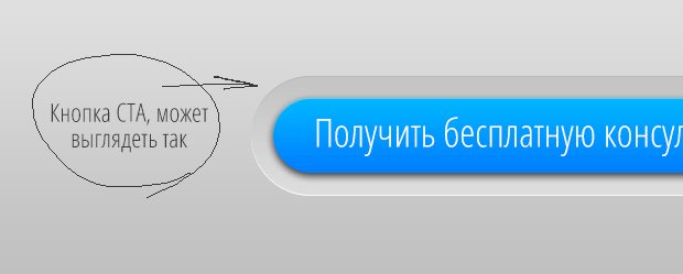
Captions should be concise and contain a description of what the user will be able to get in the end , instead of what he should do. For example, not just "Buy now", but "Add to cart, save 25%". Not “Subscribe” or “Send a request”, but “Get a free order calculation” or “Get a free consultation”. Additional explanations near the button are also allowed. There are also cases when changing even one word significantly influenced the conversion.

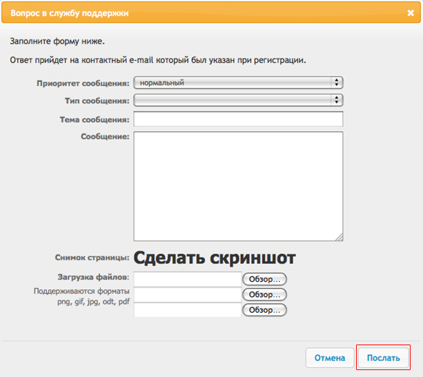
There are also gross errors in writing texts, elementary illiteracy. A glaring example is in the picture below.

We strongly recommend testing the color and texts of the buttons from time to time, this is the only way to understand the psychology of your buyer and increase the efficiency of the “call to action” elements.
