Cohort Analysis in Google Analytics
 More recently, Google has added another analytical tool to its popular services - the ability to generate a cohort report. This is an analysis that allows you to explore the selected audience, united by common features.
To whom will it be useful?
For example, you are the owner of an online store and you want to track the difference between website visitors who made a purchase through your site and those who decided to postpone the purchase until later. Or, for example, track the difference between those who made a purchase on the eve of some holiday and those who made a purchase on any other day. In this case, cohort analysis is an indispensable tool, especially for marketers and analysts. It will help to study in detail the data obtained during the analysis and, if necessary, take action.
How to form a basic cohort analysis in Google Analytics?
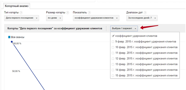
Let's see how it works. First you need to go to the "Audience" section and find "Cohort Analysis" there (so far only BETA version). It should be noted that only basic analysis is available at the moment. To generate more serious reports, as before, you will need Microsoft Excel. Now you need to customize the cohort report using the parameters: cohort type, cohort size, metric, and date range. What does each of the options mean?
- A cohort type is an audience, a group of people that is united by some common parameters. As of today, the only available parameter for splitting cohorts is "Date of visit".
- Cohort size - this parameter allows you to select the time period for generating a report: by day, by week, by month.
- indicator . This refers to the metric that will be measured for each cohort. Metrics are grouped by type: Total, Per User, Retention.
- Date range . This parameter allows you to set the time range for which the report is required: for the last 7, 14, 21 or 30 days.
Interpretation of the received data
By generating a report on the selected parameters, you can track the behavior of user cohorts in a given period. The report is displayed as a graph and a table below it. The graph will show the cumulative value of the scores for the cohorts that have been selected. Like here for example:

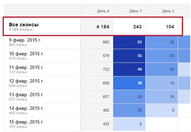
And here is the table:

In the table, each row will display a separate cohort. The topmost line shows the total number of indicators in the column. The number of rows is the date range that was selected when setting the parameters. For example, if you select “Over the last 7 days” in the “Date range”, then 7 lines will be displayed in the tabular part of the report, “Over the last 14 days”, then 14 lines, respectively.
The columns show the size of the cohort (day/week/month). Each cell of the table is the value of the indicator selected in the "Indicator" parameter. Cells can also be colored in different intensity colors. Saturation shows the value of the indicator relative to other values in the cohort.
For example, consider the first cohort called "9 Feb. 2015": in the column "Day 0" we see the total number of users who visited the site on February 9, and the next day 52 people returned from this audience to the site. A day later, it's already 25. The intensity of the color of the cells becomes less as the number of visitors decreases. We also interpret the rest of the cohorts.
In this cohort report, it is possible to apply up to 4 segments at a time. In this case, each segment in the report will be displayed as a separate table.
Finally
Now that you have a general understanding of how to generate a cohort report in Google Analytics, you have the opportunity to respond to changes in audience behavior in a timely manner and prevent the so-called customer churn. This will help to make the necessary decisions in time and conduct business correctly.
