Composition in website design: doing everything according to the rules


Eminent photographers and artists, when asked how they got such a magnificent masterpiece, answer: it's all about the composition. Why is it so important and can it be used when creating site pages? After all, each of them is also significant.
So, composition: a way of combining elements in space so that the result is harmonious. Of course, it is also used in web design, because the site should make a good impression - and visual as well.
The main elements of the composition
These include:
- Color.
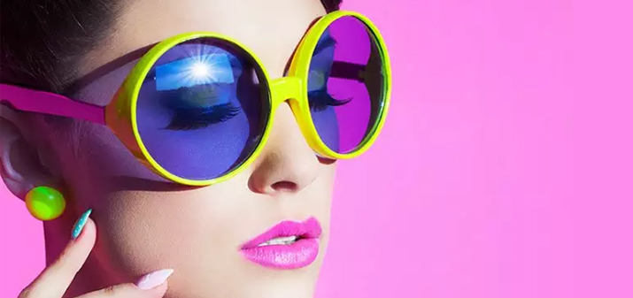 This is the basis of perception. Color conveys both mood and essence. So, juicy shades look dynamic, and pastels invite you to relax. With the right tone, it is so easy to evoke emotions and attract attention. As a rule, a call to action is made contrasting and catchy, while the background remains calm and neutral. To understand the basic color combinations, you can study ready-made website templates.
 - Location. To understand where to put important information, you should use the rule of thirds. Divide the viewport with four lines: so that you get 9 squares. The places where the verticals and horizontals intersect are where the most user views are concentrated. And 40% of users first carefully study the upper left corner. Keep this in mind when looking for a place on the page to place a call-to-action button or a bestseller photo.
- Free space.
 The page should be perceived as airy and clean. If you find here a pile of images and text blocks, it's time to do a "spring cleaning". Leave only what is really important, what reflects the very essence of the company, without flirting. We assure you that visitors love conciseness and cleanliness, they appreciate the "air" that you leave for them in the information space.
Stylish colors will give visual pleasure, a minimum of blocks with information will not let you get confused - and now your site is already so close to ideal.
Rules for the location of important information
Visual hierarchy is very important on the site: if the visitor's eye is “hooked” on something important and interesting at the very beginning, then it is more likely that a person will watch the page to the end.
How to direct the visitor's eye to what is really important? Take into account the features of skimming: the screen is scanned by the eyes along a trajectory resembling the letter Z or F.
The main elements of the visual hierarchy are:
- scale;
- color;
- contrast;
- alignment.
Combine fonts and letter sizes, image sizes and weights, and create visible linear directions to make it easy for users to follow your suggested route.
Distribute information around the page so that even its position is beneficial. And now your site is already successful on the network!