➥Developing a Landing Page in order. Building a landing page from scratch. Part 2

The previous part is here .
The product in all its glory
Exactly! And in a conspicuous place - in the header or on the first screen. If you benefited from the previous text design recommendations, then the remaining time is better spent creating a colorful product image. Here you can safely experiment without sparing time. Use Photoshop to its fullest until you get a quality image.

Down with poor quality pictures! Often you have to observe all kinds of garbage in the form of an incomprehensibly chatting device on a page or a dubious type of dish that does not cause any emotions other than rejection. The task of the landing page developer is to make sure that looking at the picture, the client has an irresistible desire to buy something that blinks or dangles in the air, which is exactly what he lacks for complete happiness.
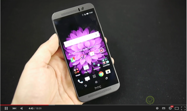
If this is a device, then it is desirable to show it in the picture in the hands of the user. Let a picture be drawn in the head of the future buyer, where he holds the coveted phone, tablet, or whatever you offer there.
If this is some kind of product, then it needs to be drawn in all its glory, as close as possible to its “live” appearance. Appetizing, so that you immediately want to eat it.

It works well to have a video presentation of the product. Plus a concise title and the product works!
Buy/order button on the first screen
Everything is simple here. The button calling for a purchase / order should be on the first screen. A person should not look for it, otherwise he will simply leave without making a purchase. On the “threshold” of the site, he should see what he can order right here, as they say, without leaving the checkout.
![]()
The button should be bright, large and in a conspicuous place. Of course, it can be duplicated somewhere else, but the presence on the first screen is mandatory. The main thing is not to overdo it with duplicates. You don't need to put a button on every screen either. Everything is good in moderation.
Minimum fields in forms

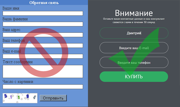
No need to overload the feedback form with unnecessary fields. After all, its purpose is to collect information about the contact and send it to the manager for processing. No more. It will be enough to leave a field for the name, phone number and E-mail. All.
Show faces
It is mandatory to display on the page such data as: the address of the organization, the faces of employees, the location on the map.
Perhaps it works somewhere on the subconscious, but a person who sees the faces of employees on the landing page, the location of the organization on the map, and similar information quickly imbues trust in the seller. Therefore, do not hide, show yourself in all your glory and people will believe you faster.
Recently, ordering a landing page has become in demand. Creating just a brightly colorful page is no longer enough for a person to go to the site and make a purchase. Here we need the coordinated work of a team of professionals: designers, marketers, technical specialists. Writing competent texts, building a structure, blocks - all this does not tolerate amateurs. By ordering the creation of a Landing Page from Web-shark, you will receive a working product and recoup your costs in a short time.
