# Development of Landing Page in order. Building a landing page from scratch. Part 1

As everyone already knows, a Landing Page is a one-page site, the purpose of which is to increase conversion by “turning” a visitor into a buyer, subscriber, etc. If the site has more than one page, then a landing page is created for the product or service being sold, the advertising flow is set up, after which you receive applications and, in fact, sell.
It is quite possible that even when developing a landing page, you can come across such problems as illiterate “selling” content and, to put it mildly, unsuccessful design of this very page. Which, of course, will not give the best result. As practice shows, successful landing pages are extremely rare.
In order to avoid creating another slag that is already overwhelming the Internet, let's look at the main points that you need to pay attention to when creating a page designed to encourage a person to the target action for us.
Landing page content
Text . This is the first place to start! It is text, not Photoshop, which webmasters often sin. Order and patience are important here if you want to create a really high-quality product. Everything should have its time. The result of impatience and chaos at the start of the workflow will be another dull masterpiece, which, not only will it not fulfill its intended purpose, will also “reward the creator” with a sense of guilt during the delivery of the project.
What exactly you need to pay attention to when writing a text:
header
It is important to remember that the page title is written for a specific request, and not for natural SERPs. It is this part of the text that must first of all correspond to the user's search query. Here, such nonsense as “We are the ones you need”, “We are the best and blah blah blah” is very common.
Imagine that you are looking for a specific product or service. In the search bar, type a specific query and want to see the same answer, and not laudatory odes to someone there! Therefore, the title of the Landing Page should match the key query as much as possible. Otherwise, the landing page will lose its primary purpose.

Water minimum
The topic of “water content” of the text has already been “wiped out” by the Internet, but, nevertheless, the problem remains relevant. Many authors make this mistake. How to avoid gagging readers who landed on such a page? More facts, figures, tables and graphs. In short, more specifics and less “nothing” text.
You should not be afraid to "cut" the text, thus getting rid of the excess. Let it be a little, but concretely and essentially. As a result, you will get exactly the Landing Page that will bring the result. The main thing is not to rush.

We speak the truth
It is important, when presenting information about yourself or a product, not to lie. Sooner or later lies come to the surface and you have no idea what it could turn out to be. Do not embellish the information and do not go on about your ambitions, which offer a little "marafet" reality.
Find existing advantages and present them in a favorable light. Even a small achievement can be wrapped in a beautiful "wrapper" and thrown out as a great merit. You don't need to write something that doesn't really exist.
Additional "buns"
At this stage, you need to write out a list of benefits and benefits that the client will receive. Here you need to be as objective as possible and boldly cross out, as they say, the sucked-out advantages of the product being promoted. It happens that the seller, pursuing, of course, his own goals, writes crazy advantages and benefits from his product, which from the side of the buyer will look ridiculous. That is why objectivity, objectivity and once again objectivity.
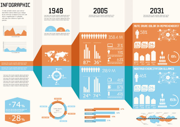
With regards to the design of the advantages, then the most interesting presentation is needed here. Infographics, markers, characters, and animations are all great ways to design this kind of information.
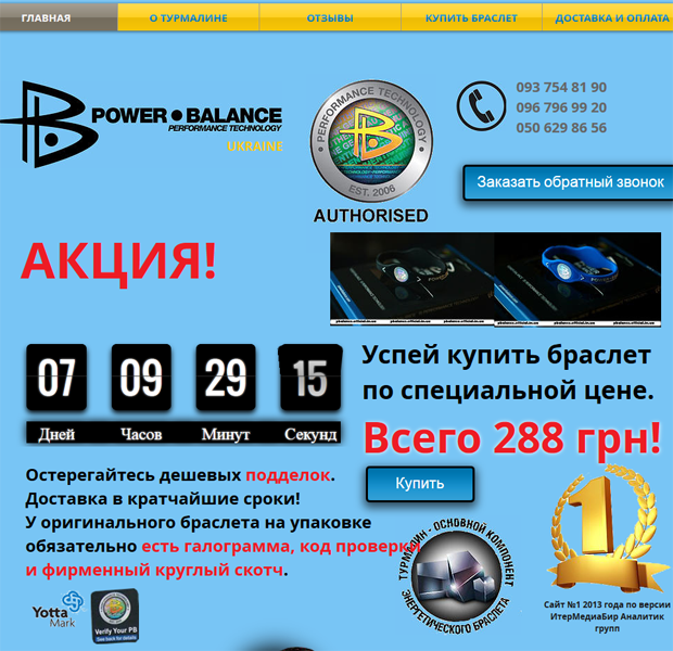
- We are announcing new items. The target audience is greedy for the words "New", "New", "Fresh", etc. It is these statements that magically positively affect landing page conversion rates.
- We post reviews. Again, returning to the topic of the veracity of information. Post only real reviews from real people. Let there be a photograph of a person and brief information about him (who is he? a manager, director, housewife, etc.) next to the review. You can often find the same "sweet" reviews on several completely different pages of different sites. And, believe me, such reviews tend to become familiar. If a person sees the same on your page, he will never return to you. “If the deception begins even before the purchase, then what will happen next ?!” he will think. And buy from those he trusts.

Once again about the design of the header. You can start with an excerpt from a review that mentions the benefits that the customer received. What follows is the text of the review itself and the name of the person who wrote it. Let us remind you once again that it is good if brief information about the writer and his photo is attached to all this information. This will show, or at least give faith that there are real people who bought (ordered, used) and that it is really good (useful, high quality). Highlight customer benefits in bold. This will once again draw the reader's attention to the need to order or buy what you offer.
Guaranteed return. Quite a strong argument that increases the credibility of the seller. For the greatest visualization of this information, you can make a microsection, “fill in” the corresponding text there. You can also use an icon or other visual component to enhance the effect of perception.
Continue reading part 2...