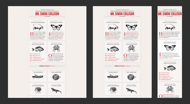
Difficulties in translation or the era of responsive design

A rich vocabulary is an important and useful thing. It's not just about cramming, but about tips on the practice of using new words. We have already talked about what responsive web design is, now let's try to figure out why it was created, what can surprise you, and whether there is any benefit from using it.
Where?
We will not delve into the dense forest of nuances of adaptive layout, it is better to immediately switch to an accessible human language and talk about the increased number of gadgets from which you can access the Internet . Now these are not only tablets, smartphones and phones, but also watches, and even treadmills (yes, you burn calories and at the same time you can scroll pictures with cats).
The variety of screen resolutions and, accordingly, the peculiarities of transmitting graphic information, which are individual for each device, involuntarily suggest paranoid thoughts about a werewolf site. On the computer, he is a white and fluffy kitten, and on the iPhone screen, he is a huge and clumsy image. Yes, we, the people of the post-Soviet space, are an unpretentious people, it’s not too lazy for us to crawl across the screen with our fingers, we’ll scroll the page to the right place if there is no other way out, but it’s time to get used to the good.
How?
Adaptive layout was created for that, so that users would love to look at the site, and the owner of the Internet resource could effectively deploy his business by communicating with the target audience in the language of the device they use. Sometimes it is difficult to convey the idea of a brand even on paper, and to make sure that the idea of a web representation is equally well implemented in the mobile version of the site is almost mission impossible. No, not Tom Cruise comes to the rescue, but responsive design, because with adaptability you won’t need to create an additional compact website for smartphones .

Thanks to responsive design , it is possible to build communication with users without "translators" and "dictionaries", because one site is able to adapt content to the needs and dialectical features of a particular device.
What for?
Of course, you can live without optimization for mobile devices, but the statistics clearly and clearly tell us about the increased demand for sites for smartphones. Attention! Now we will slightly open the door to the holy of holies - the statistics of our site. Over the past month, 30% of users have visited us “at the light” from mobile devices, and the experience of foreign colleagues shows that this percentage will grow every year.
In order for tablets and other mobile devices not to perceive your site as a manuscript covered with letters in an unknown dialect, it is advisable to think about responsive design . Of course, not everything is so radical, but search robots also vote in favor of adaptation. They befriend her because one URL is better than two for ranking purposes (no extra redirects, no duplicate content).
Optimization for mobile devices is going by leaps and bounds in the USA, Japan and Western Europe, where layout for the iPad is now very relevant.
Percentage of mobile Internet penetration (according to Google's "Global Business Map" report)
- Ukraine - 28%
- Russia - 28%
- Bulgaria - 28%
- Hungary - 28%
- Latvia - 28%
- USA - 54%
- Germany - 40%
- Japan - 77%
- China - 16%
- India - 10%
Judging by the above data, we can conclude that in Ukraine the ratio of phones used to access the Internet is quite high, but at the same time, layout for the iPhone , which is beloved in our country, is rarely discussed.
Responsive layout is not a way to take more and more precise pay from the client, and it is not a new wrapper for old content, it is, if you like, a neologism in the web world. Responsive design turns not just into a current trend, but into a convenient new element of the wardrobe, like a “snake” or Velcro.
Webakula studio keeps up with the times and is fluent in modern adaptive design slang, developing websites of any complexity.
