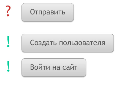
Don't use the "Submit" button

12.01.2011
When you click the "Submit" button, the information is sent to the system. It is obvious. Everyone often encounters such buttons when filling out various forms and registration fields. And the problem is that the fields are different, and the buttons are the same for everyone.
The name "Submit" describes the operation of the system, not the user. The button should confirm the specific task the user is currently engaged in (entering a name, creating an account, deleting an email, etc.) A button that describes a task tells users that the form is focused on a specific goal.
The clearer the form, the more likely it is to be filled out.
SUBSCRIBE TO NEWSLETTER
Last in our blog
Internet Marketing
04.11.2019
Internet Marketing
03.10.2019