Efficiency Rules for the Call to Action Button

29.09.2017
The CTA button helps the user to buy the product. If it is not there, the e-commerce project simply will not work. But just the inscription "buy" is not enough. The visual design of the button, its color and size is important so that the visitor not only sees where to click, but also wants to do it.
Ten factors that affect the effectiveness of the CTA button
- Location on the first screen .
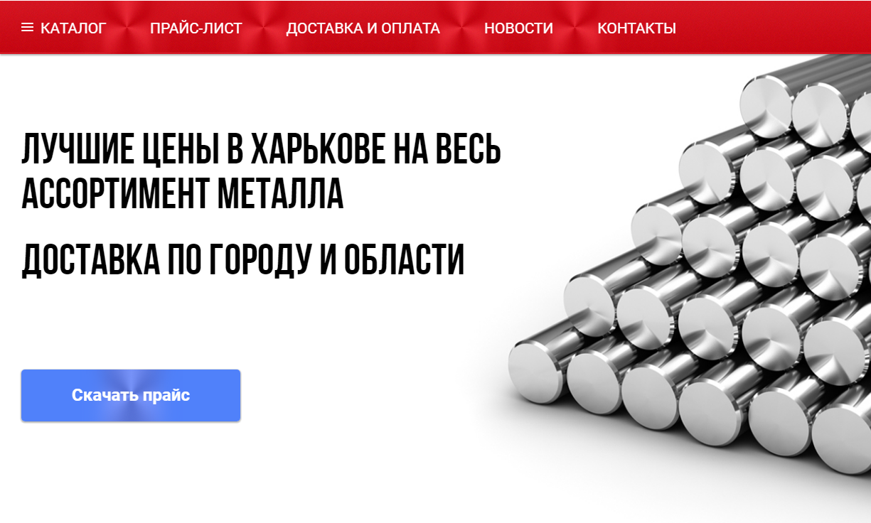 Even if the product photo is not fully displayed, the CTA button should still be on the first screen. Otherwise, there is a high risk that the user will not scroll down to find it. More than half of visitors do not open either the second or third screens. But they may not even notice a button located high up if they are exploring the store from a smartphone. Therefore, STA is raised as high as possible (within the product card).
 - Size . It is important to choose such a size that the CTA will definitely catch the eye and be perceived as the main element on the page. Then it will attract attention and definitely will not go unnoticed. But to enlarge it contrary to the overall design is not worth it. Balance is important in design.
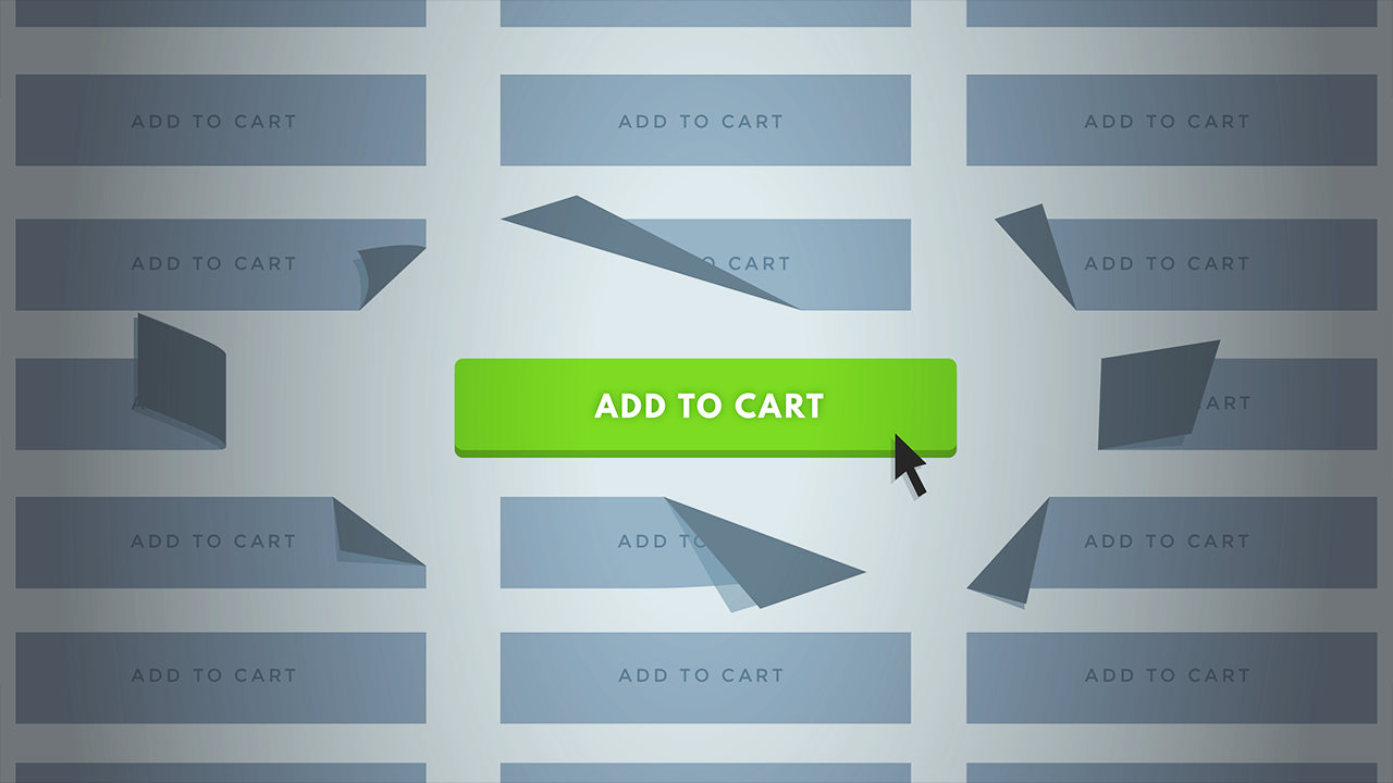
- Form . The most commonly used rectangle. Most users are looking for just such a button, as they have already become accustomed to it when shopping online on other sites. Rounded shapes are still unusual.
- Color .
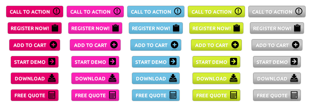 Traditionally, red or orange is chosen for the design of the button. Within these colors, it is quite possible to experiment with shades in order to "get" into the design of the site. But one should not repeat exactly one of the already used ones: it is important that the CTA stands out against the background of pictures and accompanying inscriptions.
 - Text .
 The word “buy” is most often used, but it is better to specify the action, add a little concern for the user and a call to action. Too complicated and write sentences is also not worth it. There is no need to completely abandon the text: the image of the basket and the arrow will help to orient only a very interested visitor.
 - Interactivity . Add a text field that will appear on hover or some kind of effect on the button itself so that the user sees how it is pressed. For example, you can make it convex (add shadows). Then there will be a feeling of real pressing.
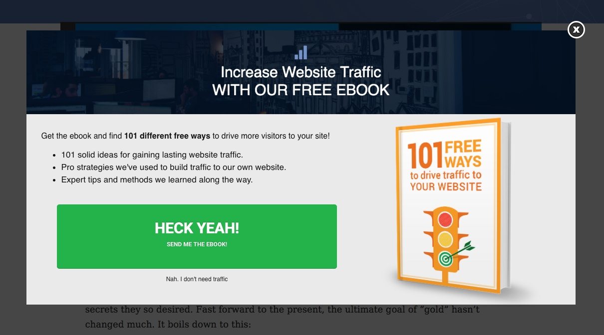
- duplication .
 On landings and pages with multiple screens, it is better to show the button several times so that the user does not forget why he came to you at all.
 - Design . The design of the CTA button should not be neglected, even if it seems that it takes up so little space on the screen. You don’t want to press an ugly button - this is a psychological barrier that “steals” your profit.
- Dynamism . It is important that the button attracts attention. For example, it can change the color or font if the user is on the site for a long time or scrolls down the screen.
- Difference from other CTA buttons .
 One of the buttons must be the main one. If you place two side by side, identical in design but with different invocations, neither will work to its full potential. You will need to experiment with colors, sizes and fonts.
Despite the fact that CTA occupies a very small part of the screen, its design should not be neglected. All the above factors should work in combination, and then the conversion will be high. But there is no need to follow any pattern. It is better to conduct A / B testing in order to understand which of the options is better for the target audience. Only after testing can one operate with proven facts, not hypotheses.
SUBSCRIBE TO NEWSLETTER
Last in our blog
Internet Marketing
04.11.2019
Internet Marketing
03.10.2019