From a pure design heart

The Ukrainian Internet market is growing at a tremendous pace, corporate sites, business card sites, online stores and blogs ... "Quickly and cheaply", "Website in three days", "Website for free" - advertising ripples, and a situation familiar to many: "I have a friend, he is in his last year, he is a programmer, he will make a website for cheap!" And websites are made... Not functional, meaningless, with low-quality design of the last century.
What should a customer do, who often does not navigate the modern web? How to protect yourself from low-quality Internet bearish services? I volunteered to help customers a little and I will write point by point :)
1) Decide on the theme of your site and its type, be it just a few pages where you present your company and tell about yourself or an online store with powerful functionality. You can read more about website types here .
2) Take a piece of paper and write, and if you want, draw a rough structure of your site. For example, write menu items, whatever you can think of, let's say: "Home", "Products", "About Us", "Contact Us", etc. Even if you get a lot of menu items - it's not scary, in the future you can combine something, and transfer some items from a text view to an icon (icon). Think about what information you want to place on the main page of the site, because this page introduces the user to your site and should make a good impression. Statistics indicate that users read about the first three lines when they are looking for something. Therefore, the main page cannot be overloaded with textual information. High-quality photos and illustrations work best for users, but it is important to strike a balance and not overdo it.
3) Think about what information you will post on the site (content), if you have the opportunity to prepare primary materials - a logo and corporate identity, texts, photographs, you will thereby speed up and help the designer do his work. There are situations when, with the development of the site, we change the corporate identity, we should not neglect this opportunity, because there are times when logos become morally obsolete, and the corporate identity does not seem as stylish as it was a few years ago.
4) Visit the existing sites of competitors, mark for yourself what you liked, and vice versa, what you would absolutely not want to see on your own site. Pay attention to the dates of the last publications, news and to the footer of the site (bottom of the page, footer) there you will find the copyright icon © and the year, if the date is several years behind, then most likely the site is abandoned and should not be taken into account.
5) Do not involve outsiders who are not related to the activities of your company in your thought process. Also, I do not recommend using the advice of dubious forums and discussions in groups of various social networks. You can get confused and draw wrong pseudo-logical conclusions.
6) Think again, do you really need a website? After all, this is not only a financial investment, but also further work on the site, if you do not update the information, advertise the site on the Internet, then it will not bring you new customers and increase sales.
7) Contact web studios or well-established freelancers, read reviews, look at portfolios, if over the past year you see sites like this:
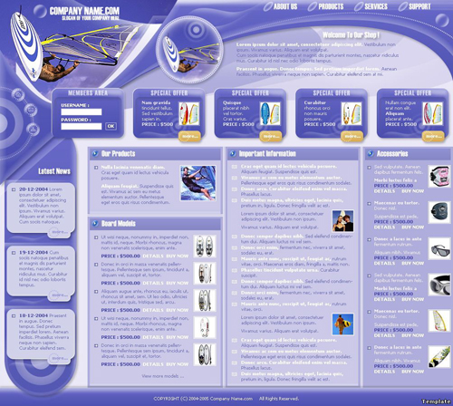
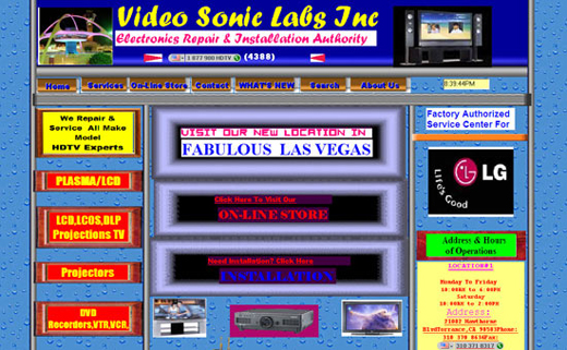
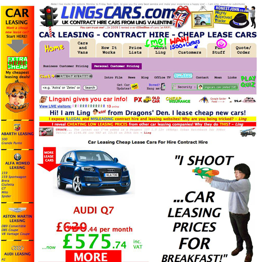
then, perhaps, you should not seek help from such professionals. If you have the opportunity to visit the office of a web studio, by all means do it, you will personally meet the people who will manage the work on your site, get detailed advice. If you need advice from a designer, you can safely ask him for it, he will tell you about current trends, the mandatory elements of a site, point out the advantages of competing sites and analyze the shortcomings using examples from various sites.
Well, let's live together, dear customers, and trust us, we want your sales to increase, and our portfolio to have good sites!