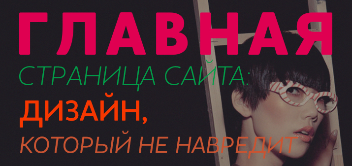
Home page of the site: design that does not harm

They are greeted by clothes - a hackneyed phrase, but true. For Internet resources, the main page of the site becomes such “clothes”. It is she who attracts (or repels) visitors, and therefore impressive sums are spent on design development.
And here it is important not to overdo it: too pompous and “multi-tasking” design will do more harm than help to remember your company.
Homepage design: what to add and what to exclude
Let's look at each design element, from structure to call to action:
- Structure: simplified as much as possible.
Content is served neatly, images are kept to a minimum. All elements located on the main page should be clear to the user. Information is placed according to the principle of an inverted pyramid: what is important is at the top. In the header of the site - necessarily a brand or name, line of business. Changing pictures, too long text and pop-up banners will only hurt: the user should not search for information for too long.
- Images: high quality.

And don't overdo it with photos. Even if they are chic, let them be no more than three. Poor quality amateur photos can be harmful. If you don't want clients to remember you as an amateur, choose professional photos. Fortunately, they can be found on free photo stocks or in private collections.
- Background and color: neutral and catchy. The main page has its own mood, and it is provided just by the color scheme. But any background image (photo or pattern) should not distract from the information presented. As for the combination of colors, it is better to develop a combination that embodies your brand, rather than borrowing ready-made solutions from others.
- Buttons: visible and clear, with a clear call.
Go to the directory, register or buy: if you are displaying a button with a targeted action on the main page, then it must be attractive enough to click. Also think about the text: crisp and clear, but unobtrusive. The location of the button on the page also matters. A page with a single button is always more intuitive than one with multiple choices.
- Text: concise, on target. Large, easy-to-read letters and extremely simple content: users should instantly understand what you are doing. For those who want to learn more about your company or personal brand, create some references. The history of a company or a personal path to success can be described on pages specially created for this purpose. And on the main page, leave the essence.
Anything that is difficult and ambiguous is perceived can harm. But up-to-date, readable information will never be superfluous.