How to combine fonts
Much has already been said on this subject, and much of what has been said deserves attention. But still, to begin with, it would be worth asking the question: why combine different headsets? As practice shows, you can get by with one style and achieve convincing typography.
There is an established opinion that it is necessary to use different fonts at least for decorative enrichment of text material. But this is rather a superficial judgment and such an approach will not bring worthwhile results. But if by combining typefaces to seek to identify the internal structure of information, then this occupation is much more noble. And having such a position, we can confidently answer: you need to combine fonts if it is caused by the logic of information, and if the combination is not justified by anything, then it is better to avoid it.
The next question is how to combine? And again, it depends on the structure of the material. It may require contrasting font relationships, such as a massive active headline and loyal narrative text, or nuanced relationships for light emphasis, italicizing a quote.
But in order to somehow systematize this approach, it is proposed to designate several principles by which fonts can be characterized. And then you can proceed from the characteristics of fonts, combine them according to similar properties, or on the basis of contrast.
Construction and logic of building letters
Dynamic and static
Degree of contrast
Proportions
Saturation
Here it is necessary to pay attention to the shape of the signs: whether it will be a geometric font or a handwritten one. In many recommendations, they write about the harmonious combination of fonts from the same author. And this is true, since the construction logic in the fonts will be preserved.
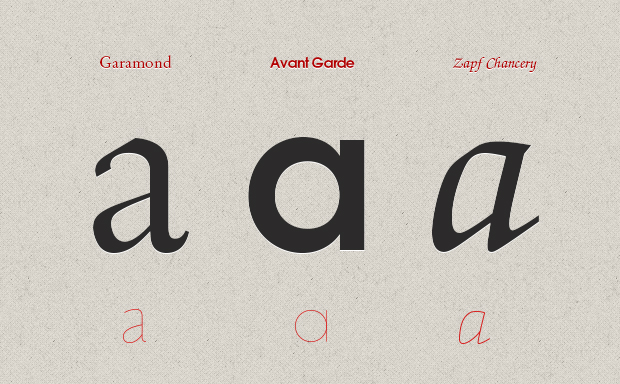
Fonts can be divided into these two groups, regardless of whether it is grotesque or serif. The combination, again, can be built on the contrast of statics and dynamics, or on a nuance.
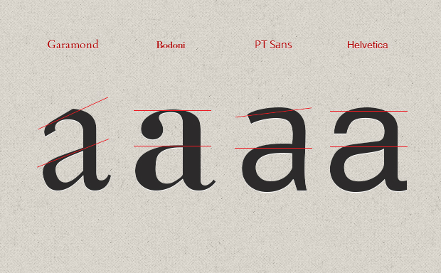
This is the ratio of the main stroke to the additional one.
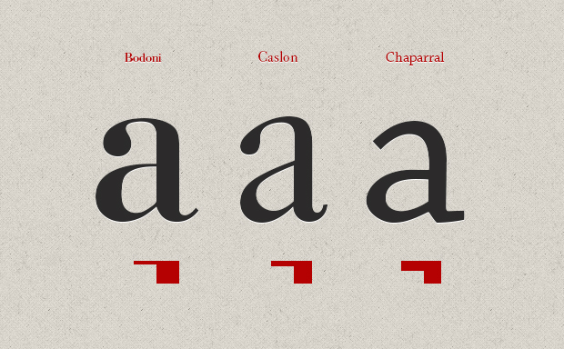
This is the ratio of the height and width of the character, the ratio of uppercase and lowercase, as well as external elements. It is often recommended to combine fonts in similar proportions. But as we already know, this is not the only option.
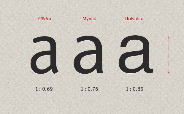
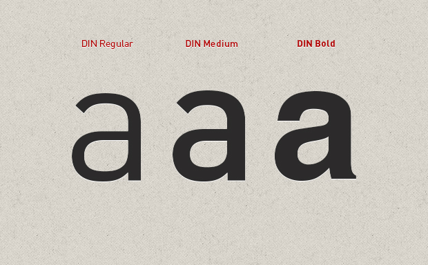
This is what is also called fat. The ratio of stroke thickness to character height and width.
Now we can summarize what has been said. Fonts can be combined according to their characteristics, either in contrast or in nuance, but always keep in mind the internal structure of the text. And choose the method that is most appropriate to use. And of course, the most important thing in this process is experience and practice.
