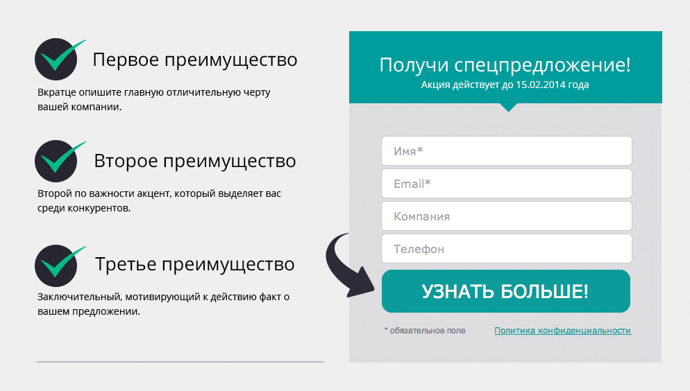
Landing Page - successful landing on the landing page

You have a website, you have something to sell, and that's great, but the harsh reality is in a hurry to upset you: when you get to the landing page for the first time, 99% of potential customers do not make a purchase. Why? Don't worry, we'll tell you everything.
Internet sales algorithm
We will immediately reveal the intrigue: site visitors do not place orders and do not call your office the first time they visit the site out of caution. To a stranger, even if pleasant in communication, pretty and polite, they are still treated with distrust. The user is quite likely to look at you again "at the light", but later. To begin with, your future client explores the market, having familiarized himself with similar offers from other companies, and only then can make a choice in your favor.
How do we search for the necessary product on the Internet? By quickly clicking on links from the search results, we compare offers, look for favorable conditions and excellent quality. For each site, on average, we generously allocate a full 8 seconds of our precious time. During this period, the user should like (or at least not annoy) the design of the site page and, of course, the product or service itself.
The main engines of sales on the Internet:
- SEO (search engine optimization);
- Contextual advertising;
- Social networks.
Whether it's a link from a thematic public, targeted or contextual advertising, or the top position of the site, sooner or later a potential buyer will land on your site's landing page.
Landing pages - the basics of Internet marketing
The very ideal landing page that will keep the user on the site for more than 10 seconds looks something like this:
- Selling design . Intuitive navigation, business-appropriate design and well-placed accents.
- Maximum facts with minimum words . You should not overload the user with long and lengthy texts, but it is also not advisable to leave him without important information.
- Clearly articulated benefits of the company, product or service. Users love numbers, statistics and a transparent pricing system. Facts must be right on target. They are designed to interest or even intrigue the visitor, such as promotions and special offers for limited time activities.
- Feedback form . On one landing page, one form will suffice, but it is highly visible, simple and concise. Visitors to the site will be able to leave their mobile phone or e-mail in order to learn more about the special offers of the site, clarify the information they are interested in, share their wishes and suggestions.
- Segmentation . It is logical and expedient to create separate landing pages for different types of goods or services, but this is not enough. To increase conversion, it is necessary to set up and design landing pages for certain categories of users, according to their gender, age, and field of activity. For maximum compliance of your product with the needs and desires of the client, provide site visitors with the opportunity to choose the best option for cooperation. For example, a concise, well-structured website menu with appropriate categories that will lead it to the required landing page perfectly copes with this task.
- Usability . Nobody canceled the rules of good taste on the web. Fast loading of a landing page, uninterrupted operation of the site, and accessible presentation of information, of course, have a positive effect on the favor of users.

Lead generation and real profit
Hooray! You did everything according to the rules, and a myriad of calls and applications fell on you, everyone is eager to get your product or service as quickly as possible. It should be remembered that site visitors are often not ready to part with their finances and place an order right now, but their decision can and should be influenced. Landing pages provide users with information about products, as well as offer additional bonuses in the form of promotions for site visitors who fill out the feedback form. In exchange for contact information, site visitors will be able to clarify all their questions.
At this stage, online business meets offline reality, it's time to salute potential customers with impeccable service, namely the work of managers and call centers. The completed form on the site is only 50% success, the application still needs to be turned into a sale using one of two methods:
- telemarketing;
- e-mail marketing.
In the first case, applications are processed by phone, in the second - by sending emails. Both options for working with visitor contact details are aimed at persuading them to make a purchase, turning them into regular customers. Improve landing on your site and collect applications, and we will tell you how to process them correctly in our next post.
