Logos-2018. Ten key trends of the year
19.01.2018
To understand how logo design will change in 2018, just look at the work of leading studios and analyze what solutions are most popular on sites like Behance.net, Dribbble.com. They use different techniques and styles, but there are common trends. They are considered trendy.
The most popular ways to design logos
Here are 10 key trends that help create a noticeable and effective logo:
- Conciseness and simplification. Simple shapes, a minimum of colors, the almost complete absence of complex graphics - all these are the key signs of a new trend. Designers tend to believe that minimalism will last a long time. The sustainable popularity of the trend will ensure cross-platform. Indeed, a logo that is not overloaded with design elements looks equally impressive in the header of the site, but on a business card or advertising booklet. There will be no difficulties in reading both on the billboard and on the smartphone screen. By the way, many major brands have already rebranded and replaced the logo with a simpler one.
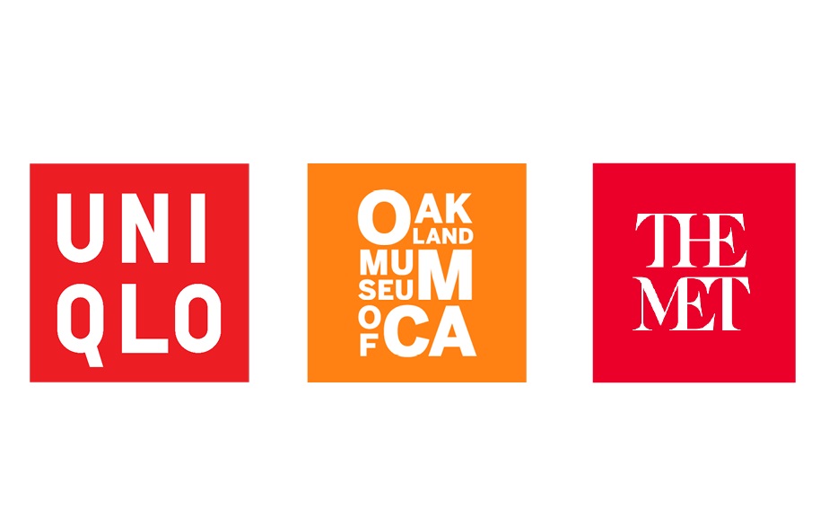
- Letter stacking or text logo, letter design. In this case, the emphasis is on the unusual arrangement of the text - not linearly, but in a column, column, steps, and so on. Often designers also add backgrounds, color effects, or other elements (such as simple geometric shapes). But the key still remains the text - the background colors should not load it, distract attention from the inscription.
- Clear font and elementary geometry. The text changes from artsy and complex to simple and easy to read, and is also complemented by geometric shapes. As a result of the use of circles, linear underlines, framing squares, the text logo turns into an integral composition. This is another way to get away from the overload of details, while maintaining the effect.
- Seals, emblems. Designers like this trend for its artistic expressiveness, and company owners for its solidity and status. Most often, images or an inscription are enclosed in a circle, but this is not necessary. Dates, lettering, lines, or simple graphics can all be used. The key style for such logos is retro.
- Slots - for example, an inscription or image, divided by wide parallel lines. Slits visually lighten the logo, make it light and transparent. Designers who work with this trend can also add visual effects, including making the logo voluminous and convex due to the slots. This design method is not yet very popular. Perhaps the peak of its demand will just be in 2018.
- Negative space or negative "empty" space. This is one of the most sensational trends of the past year. Designers have learned how to work with pictures perfectly, and now they are mastering the text. Letters or places of their contact in the inscription will be an excellent field for the location of "hidden images".
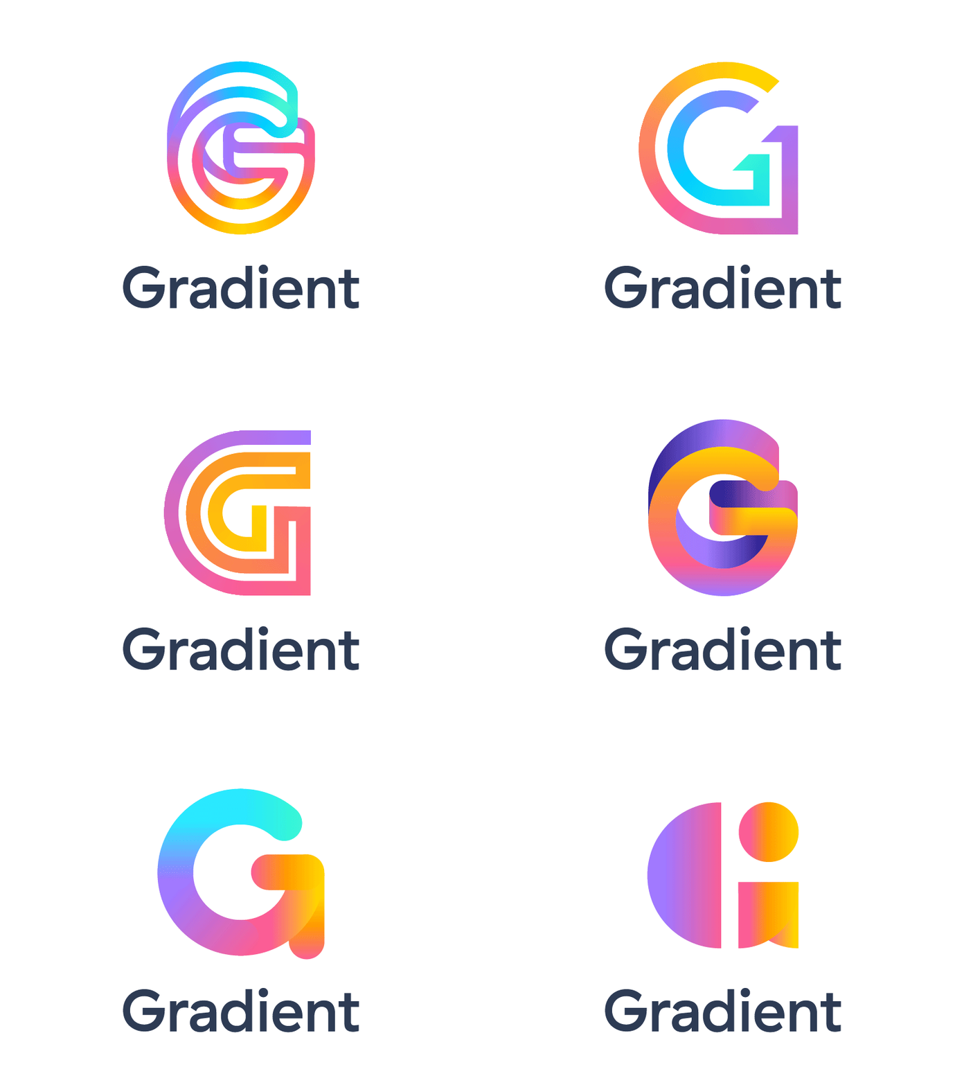
- gradients. Smooth color transitions in the design of inscriptions and images have been relevant for 2 years, but their popularity is not declining. With the help of a gradient, the entire logo, only the image or only the inscription can be decorated. Color transitions are especially in demand if the logo in one color looks massive and heavy. It is also often used for large fonts.
- Color overlay or overlay. The reason for the development of this trend was the rebranding of MasterCard. The key advantages of overlapping designs are variability, the ability to experiment not only with color, but also with shape and text. Usually, three colors are used in a logo of such a plan: two basic “side” colors and a third, which is obtained as a result of overlapping.
- Text experiments. Text logos became the most popular in 2017, and today the period of experiments with fonts continues. Unusual letters and their no less creative combinations, indents and intervals - the text becomes a graphic object and a field for expressing an idea.
- Lettering or drawings from letters. This trendy design element is created without strict restrictions unlike fonts. This trend is contrary to the general simplification, but is not going to lose popularity. First of all, it will remain in demand for family businesses where traditions are honored, and for cozy small shops with pastries or cafes.
These trends will be key, but not the only ones. The year is sure to bring a lot of bold decisions!
SUBSCRIBE TO NEWSLETTER
Last in our blog
Internet Marketing
04.11.2019
Internet Marketing
03.10.2019
