The main web design trends in the new 2013

It is not at all new that the world of information technology is constantly changing and evolving. And along with it, web design is also undergoing changes: you won’t have time to look back, but there are already new trends on the market. And to create successful sites, you need to regularly monitor and come up with new creative ways to improve the appearance of the site.
Here are some of the global web design trends for 2013:
- Responsive design is always in trend
- Large sizes are in fashion
- Endless Page
- Simplicity is eternal value
- Brand over design
- Landing page minimalism
- Typography to the full
- Ribbons and seams
- Vertical scrolling is a priority
- The user is above all
Most users today prefer to use all kinds of mobile gadgets, and this trend is growing. Therefore, your site must be displayed correctly on smartphones, tablets, and large monitors. A design that can provide this is called "smart" design or "responsive".
With the development of "touch and tap" on various devices, the trend of large buttons and images is becoming increasingly popular. Huge can be either one element or several - when used correctly, it looks quite attractive and stylish.
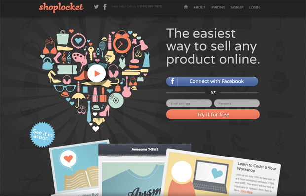
The so-called parallax scrolling is another godsend in the evolution of web design. It makes site navigation easier and more interesting. In addition, in many cases it is much more convenient for the user. Many people think that the future belongs to one-page dynamic websites.
Sites made in a minimalist style are gaining momentum. They are not overloaded with graphic elements and unnecessary information, which increases usability. Such sites will always be popular among users.
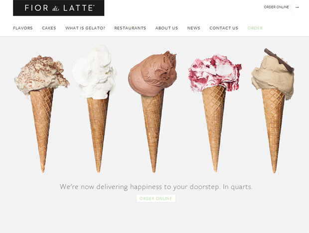
Creating a design using corporate colors and a logo will allow you to tell about your business through a website. Therefore, designers need to focus on choosing elements that are inherent in the company's brand.
Landing pages are essential to draw attention to your product or service. The new trend in landing pages is minimalism: the page should be simple and focus on the product itself, and the process of ordering a product or service should take only one click.
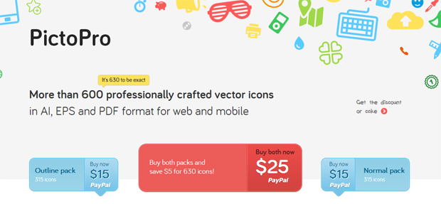
The trend of using large images and buttons extends to typography as well. You can use a font that will fill the entire browser window. Someone considers this annoying, but this can only happen with an unprofessional implementation of the design.
The most common website design elements in 2013 are ribbons and seams. They are used in buttons, sliders, and menu blocks.

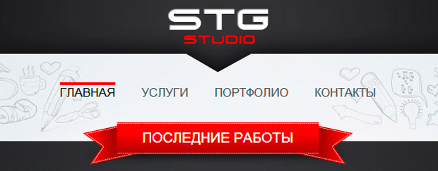
Vertical scrolling is convenient and easy for users to navigate easily. As site visitors scroll down the page, the menu heading will always follow them so they don't have to constantly go back to the top to view other sections. The same applies to the shopping cart and social marks. Vertical scrolling may well become fashionable, especially if one-page sites become popular.
Usability is no longer just talked about, but also used in practice. Sites that are not built with a focus on user convenience are doomed to fail. Therefore, usability will become a wonderful trend in 2013. The forces of developers are thrown at creating comfortable conditions on the site so that site visitors unconditionally turn into a client.
