The Secret to Designing Attractive Interfaces

It's about realism. The task of the designer is to give volume to flat objects, using irregularities, roughness, highlights and shadows, textures. Ideal interface elements look like they are lying on your desk.
When working on a single element, you need to ask yourself the question "What would it look like in the real world?" For example, a button:
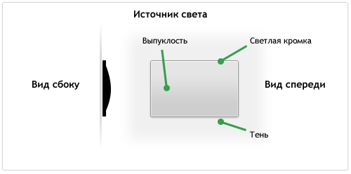
It looks a little raised, it has a matte surface, a slight bulge and a thin outline. In 3D space, the light source highlights the edges of the object, and the bulge gives a slight darkening in the bottom half of the button. The element rises quite a bit above the surface, so its shadow is small.
Good interface elements tend to look very realistic.
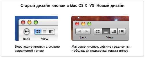
Apple once used shiny glass interface elements in MacOS X, then there were rumors that a total update of the interface with matte elements was being developed. A full update never happened, but for several years matte textured elements have been replacing shiny glass ones.
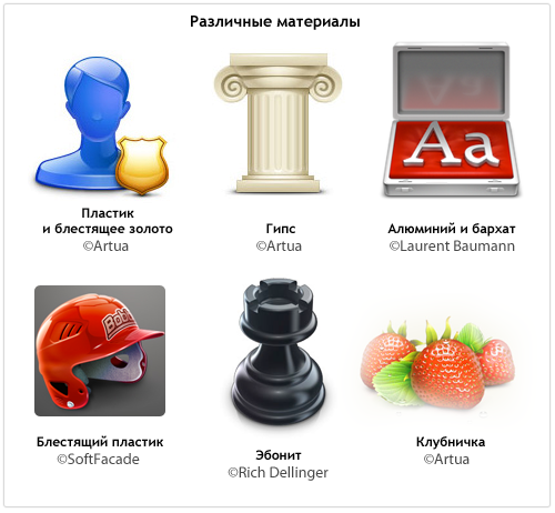
Examples of how different surface types affect the appearance of an item:
When something in the interface hurts the eye, it looks like a fake, something that cannot be in reality.