Tips for working on a responsive logo

Responsive design is widely used today. And the further, the more often the adaptability of logos leaves much to be desired.
If you look at logo examples on some sites, you will notice that a rubber layout was used, in which the image is stretched and reduced depending on the screen size. It often looks terrible. Sometimes you can find such a carelessly adapted logo, when incomprehensible characters and unreadable inscriptions are displayed when the proportions are changed. To avoid such troubles, let's look at some recommendations.
Corporate identity and branding principles
A company that pays enough attention to the development of an identity always has several variants of logos in stock for different devices. At a minimum, this is a vertical and horizontal arrangement.
Ideally, you need to change the approach to creating an adaptive logo. It is necessary to change the logo itself, not the size of the container, thus creating separate versions for desktop devices, tablets and smartphones. All this is written in the corporate identity guide.
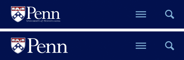
Below you can see the emblem of the University of Pennsylvania. In their case, the style guide provides for a scaled-down adaptive version of the logo. ![]()
The reduced version of the logo is devoid of small text, and the main inscription is aligned with the height of the shield. The second option is better for perception. In the header, both versions are 320px and look like this:
Without a style guide, be careful what you do
Not all logos come with a handy guide to action. In such cases, we offer to implement our own ideas. The main thing is not to get carried away so that the logo does not lose its own recognition. Here are some tips for this:
Decrease logo detail . For example, consider the Argento logo. There are a lot of small details here. Designers have reduced their number for the best perception of the logo in a reduced form.
![]()
Here are some more specific recommendations on what to do in case of many small details:
- Small items can be combined into one larger one.
- Replace stroke on objects with fill
- Make thin lines thicker.
As you can see in the pictures, each version of the logo provides a small amount of detail compared to the original, which makes the logo easy to read.
We place the logo horizontally . This version of the placement technique can be called the simplest. Using the example of the Case-Mate logo, you can see that the logo that was placed above the text was placed to the right of the text in the adaptive version. You can also place it on the left.
![]()
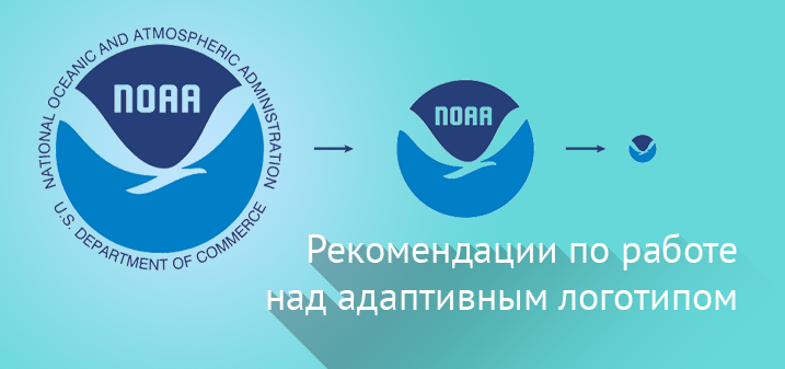
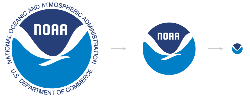
We cut off the excess . Sometimes, when the original version of the logo contains small fonts, when working on its adaptive version, these fonts need to be removed. If, even after excluding small fonts, the logo needs to be reduced even more, the inscriptions inside the logo are removed. Recognition is not lost. An example of such work can be seen in the case of the emblem of the National Oceanic and Atmospheric Administration (NOAA).
Finally
There are many options for customizing logos. Each of them requires some effort from the designer. I would like to hope that very soon for people working on the creation of the site , this practice will become mandatory.