Two-column layout (fixed sidebar and fluid content)

What are the layout requirements?
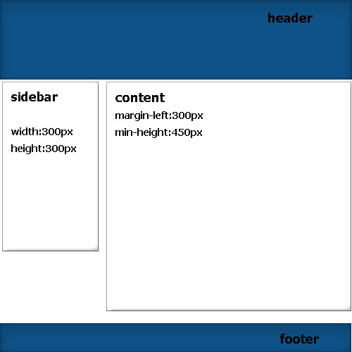
- Rubber two-column layout
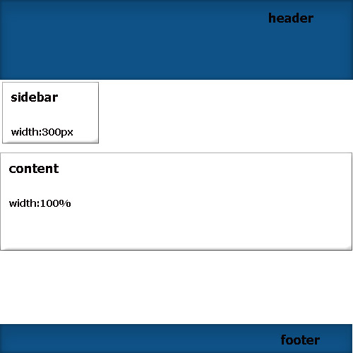
- sidebar fixed width 300px
- content is stretched to the rest of the width.
- footer pressed to the bottom (in this tutorial I will not show how this is done).
What Css problems arise when laying out such a layout:
1 way.
If you float blocks, you must give them a fixed width (you can't set 1 sidebar for 300px and 100px content). In this case, either the content slides down or a 300px horizontal scroll to the left appears. Well, the main thing to understand is that this method does not suit us.
2 way.
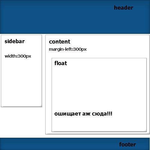
Many typesetters offer this method, what are they thinking about?! The essence of the method is that you can set the sidebar to float with a width of 300, and not float the content and set margin-left: 300px to it. A good way and everything seems to work so well. To be honest, I thought this was the best way, but this method has its own pitfalls. The reasons for abandoning this method are that if we suddenly make up in the content, for example, a menu with floated li or any other float blocks and then we want to clear them with clear:both, then the bottom border of this block slides down to the level of the bottom border of the sidebar (What and it's not strange since foat is cleared, you can avoid this if you set the floated block to a fixed height , but this is not at all the case to set a fixed height).
3 way.
Can be used for sidebar position absolute , but only if you are sure that the content will be larger than the sidebar in height, otherwise the entire content of the sidebar will fit on the footer (after all, absolute positioning pulls out of the general flow).
But as for me, this is also not a very good way!
4 way.
"Great way, if it has any flaws please comment. But I think this is the best way."
- Advantages of this method: firstly, DOM content will go before sidebar, which is good for search engines.
- nothing will fit on the footer
- any blocks can be cleared and nothing will slide to the lower border (So we overcame the problems of the second method).
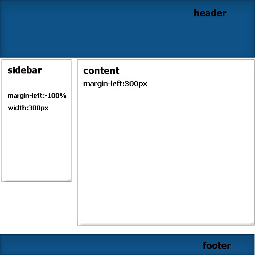
In general, how it works: look at the code first comes the content followed by the sidebar. we set float to these two blocks (of course the sidebar slides down). after that we set the sidebar property margin-left:-100%. great, it's back in place, and indent the content with margin-lerft:300px.
html
<div id="container">
<div class="content">
</div>
<div class="sidebar">
</div>
</div>
css
.sidebar{
 width:300px;
 display:block;
 float: left;
 margin: 0 0 0 -100%;
 }
 .content{
 min-width:723px;
 display:block;
 float: left;
 margin: 0 0 0 220px;
 }