Typical catalog errors in an online store
The catalog in the online store provides the ability to search and order the desired product. If navigation through the catalog is organized with errors, then visitors do not find the right product and go to a convenient online store . We will tell you how to avoid common mistakes in the structure and functionality and not “kill” the conversion.
7 structural errors
Here are the main structural errors that make it difficult to search the directory:
- A huge number of categories.
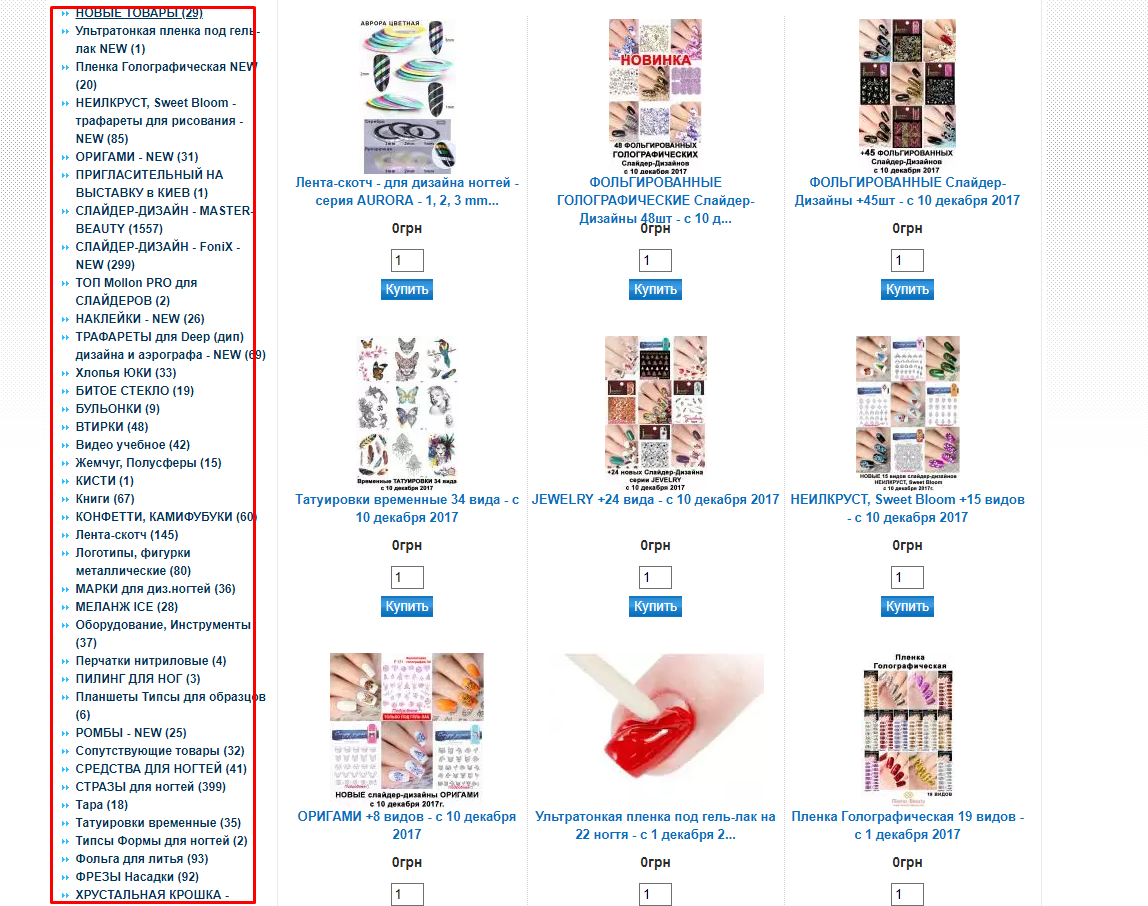
If you simply list product categories in the catalog, without dividing into subgroups, then it will look like a “sheet” of text. Don't force visitors to read the entire endless list. It is better to divide the goods into subgroups, choosing some common unifying feature (purpose, method of use, material, color). - Irregular nesting.
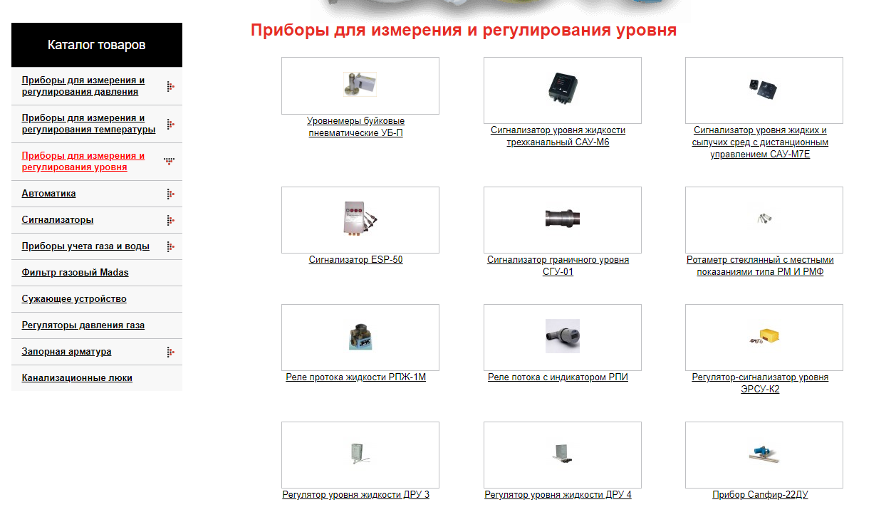
It is worth excluding the situation when in one case the subsection includes 5-10 categories, and in the other case it immediately leads to the page with products. Because of this, users may be confused. Make sure that the number of categories in different sections is approximately the same. This approach will help to organize the catalog, make it easier and more understandable to use. - Sections of various sizes. The size of a section depends on the number of nested categories. It should be approximately the same throughout the catalog. The optimal number of categories in one section is from 3 to 7. It is already difficult to search in longer lists. But split into sections with 2 categories is not worth it. It is important that the volume is approximately the same throughout the catalog so that users can confidently navigate it.
- Duplicate products in similar subsections. The division into subsections should be clear and understandable so that the user does not have to look for similar products in two adjacent categories. Products with identical characteristics and properties are best presented in one section.
- Section "miscellaneous" or "other".
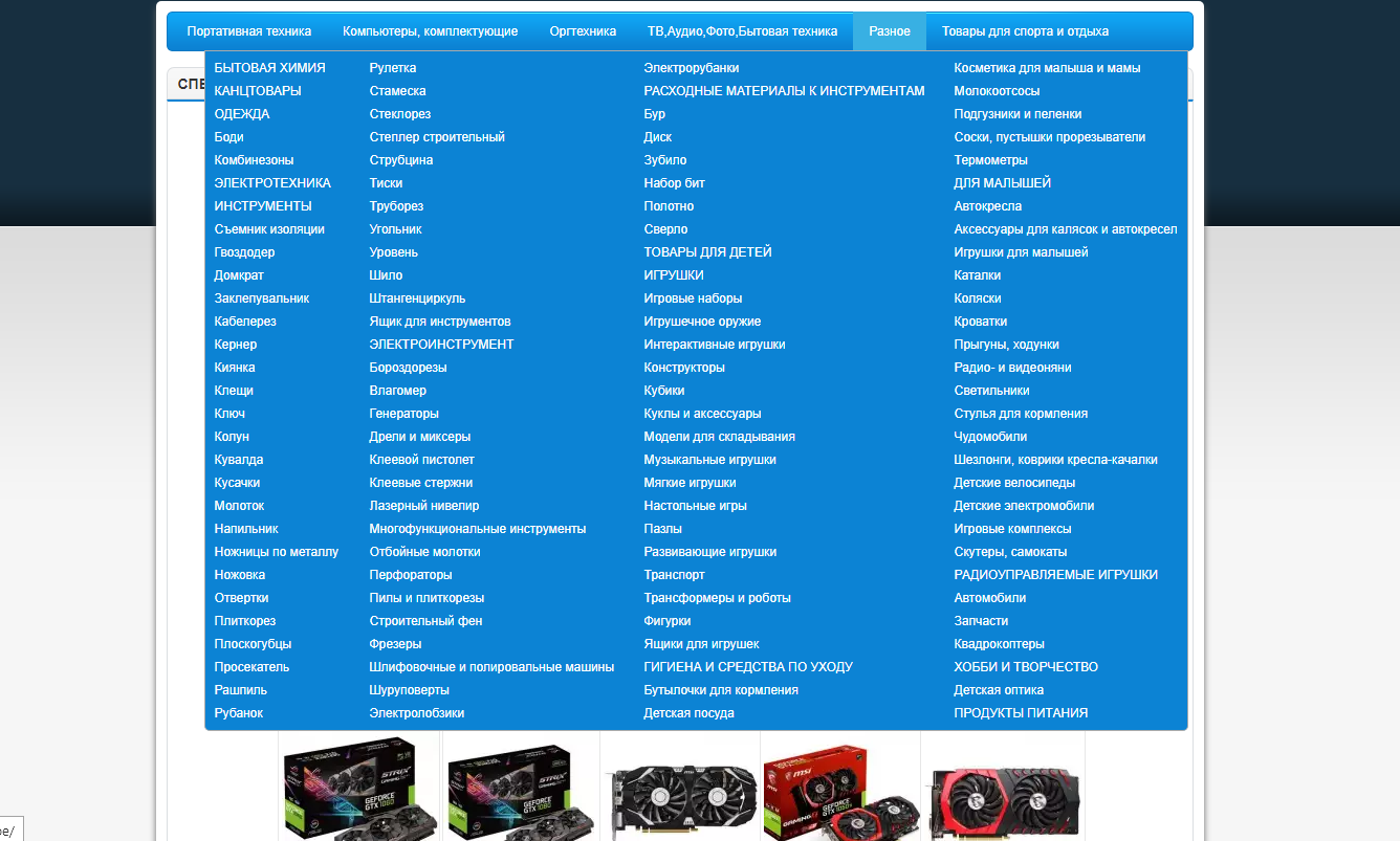
All sorts of "other" categories are opened in catalogs very rarely - simply because visitors do not know what they may contain. It is much better to immediately think of a structure that covers all product categories. Thus, you will significantly facilitate the search for the client and improve usability. - On the product page - things from different categories. Such a "scatter" makes the choice very difficult. No need to offer face creams on the perfume page or shoes in the clothing section. It is unlikely that the visitor is so interested in buying from you that he will understand the heap of categories and products.
- Free location without taking into account the popularity of the product. This mistake is also called "ignoring demand." If you know that cosmetics are bought from you most often, but children's toys are the first category in the catalog, this is almost a failure. You can evaluate the relevance of a particular category by keywords. Use search suggestions to understand what and how often people might search in your store. Google KeyWord Planner helps you estimate the number of search queries for your products - replace it with a Google tool. Accordingly, the greater the number of requests for a category, the higher it should be located in the catalog.
4 catalog functional errors
Now we will talk about the convenience of using the catalog, filters and search. Here are the main functional errors:
- Search imperfection.
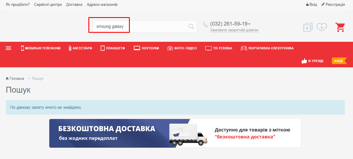
Allow your customers to search for products with missing, changed letters in the name and with the English layout. Typos should not affect the search results, and then even inattentive buyers will be able to find the right product. - Full list of results. If you give the result "in one canvas", then the buyer will not be able to compare offers and will leave. Instead of a list, it is better to immediately display product cards, showing a photo and a price. This makes it much easier to make a choice.
- Catalog without filters and sorting. For example, among leather jackets there can be short and long, blue and red. The client should be able to filter the products in the catalog according to the selected criteria. Among the important criteria for filters are cost, size, popularity, color. This may be power, material or other characteristics that are important for the product group.
- Too many filters.
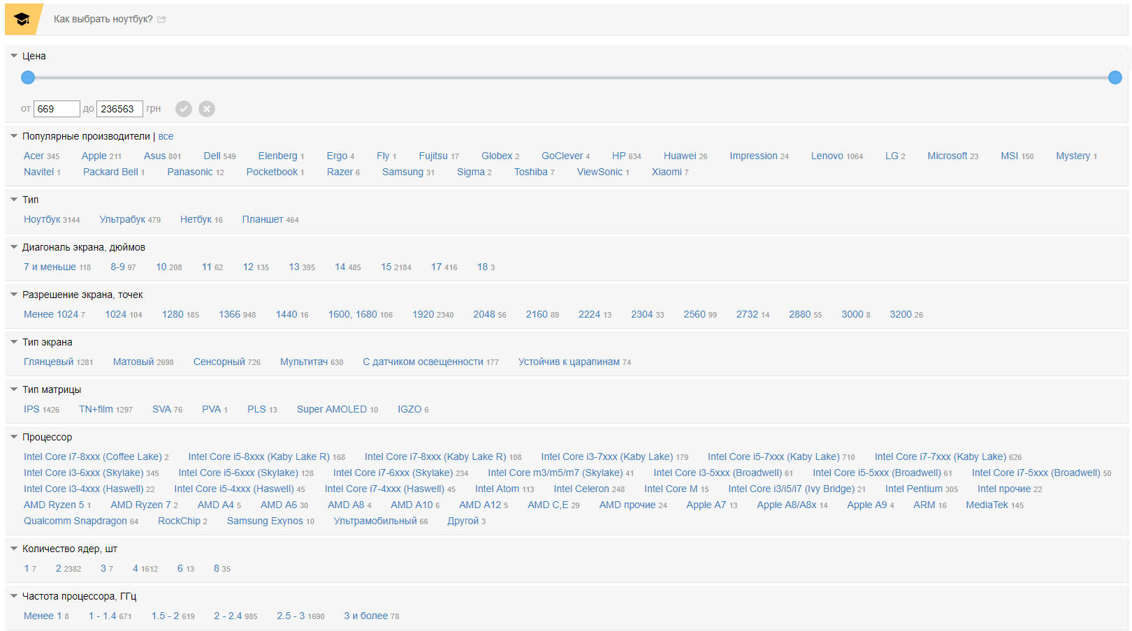
This is also bad, because the user can get confused in the characteristics. Focus on clarifying words in key queries, the so-called trains. This will help you understand what is really important for most potential customers.
There are 3 more errors that are neither structural nor functional, but affect the usability of the catalog and the conversion.
The first is typos. An accidentally missed letter or an inconsistent ending may be completely invisible to developers, but for customers it will become a signal “something is wrong with the store”. To notice errors when the eye is blurry, you can print the text, copy it into a text editor, change the font. In other words, it needs to be visually changed, and then you yourself will notice all the grammatical “mistakes”.
The second is the use of different forms of names in product categories. The list in the catalog should be easy to read, which means that the same word forms are needed (if “toys” - then “books” and “creativity kits”, and not “read” and “we develop”).
The third is ignoring key queries in the titles. By not using keywords in category designations, you push the needs of the target audience to the background. Keys are the very words that potential customers use to search for your store in search engines. Focus on Google KeyWord Planner, and the category names will be clear to the target audience.
All these errors in the catalog complicate the selection. Get rid of them, make the online store catalog convenient, and customers will buy more!
