We increase the email marketing subscription base: we attract new customers in different ways


Let's start with the main clarification: email-sending has nothing to do with spam, because letters about the company are sent only to those of your customers who themselves wanted it. In a word, if spam can "fall on your head", then an email newsletter is what people are waiting for, because they themselves have subscribed to it. It’s clear, and it’s easier to promote your company if you constantly introduce new promotions and offers to subscribers, that is, the target audience, and not “spray” on everyone around.
There is only one caveat - the information contained in your letters can benefit customers with one click, but if the subscription base is small, then a significant increase in your company's profit will not work. Sales volume (mailing effectiveness) directly depends on the number of your subscribers.
Six completely legal ways to increase your subscription base
 No shopping email lists! But in order for the “white hat” methods to work, you need to offer really interesting / useful content, as well as correctly and unambiguously format the call to subscribe and simplify the subscription form itself as much as possible.
After that, you can experiment with the method of increasing the subscription base:
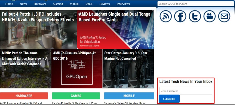
- The subscription form is moved to the main page. This page attracts the most visitors anyway. Therefore, the subscription form simply must be here. Just supplement it with understandable content: why would a person waste time reading the news of your resource.
- The subscription form should be duplicated on all frequently visited pages of the site. And there are several reasons for this. Firstly, a person can get to your site from the search immediately in some section, bypassing the main page. Secondly, he may get carried away browsing your content or catalog, and then he will not want to return to the main page in order to subscribe. And on those pages where there are few visitors, you can give a link to the landing page, where all the benefits of a subscription are reflected in detail, clearly and in an accessible way.
- You can not fix the subscription form, but design it as a pop-up window. It should appear for interested users - for example, if a person spent more than 3 minutes on the site, opened several pages or went to a page with your business offers, tried to download content, and so on.
- It is worth encouraging the subscription to the newsletter - this way you will attract many customers, because a person is pleased to receive a profitable gift for a simple, in general, action. You can give: a discount on the first purchase, access to the closed section of the site, an e-book, a training course, the ability to communicate on a thematic forum, and so on.

- You can place the subscription platform not only on your website, but also on social networks (with the obligatory mention that only the website provides the most complete information), in comments to your own articles on third-party resources and other Internet platforms.
- On email marketing services: Unisender, Subscribe.Ru, SmartResponder. Such services have a lot of visits every day, so a subscription to your resource will be seen by many network users. However, if you decide to use such services for free, then the number of subscribers will be limited, and it will be impossible to import the collected subscription base.
Rules for designing a landing page for a subscription
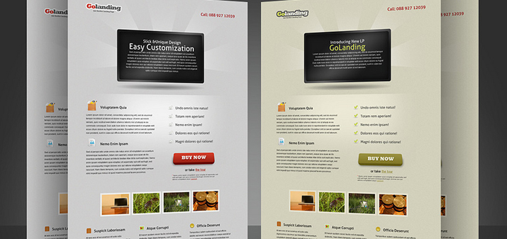 If you decide to issue a special subscription landing page, it will need to be done according to the rules. For each of the components - content and subscription form - these are special recommendations.
So the content is:
- attention-grabbing, bright, emotionally colored headline. It should mention the main benefit of the subscription and contain a clear call to action. For example, “subscribe if you want to be the first to receive information on last-minute trips” or “I earn 100,000 rubles a month on copywriting, if you want to know how, subscribe”;
- body text, with a sequential listing of the benefits of the newsletter you offer. It can be arranged according to the principle of an “inverted pyramid”, that is, the main thing is to take it up, or you can use the “slippery slide” rule and bring the reader from simple to complex, so that he himself wants to subscribe;
- a positive impression can be supplemented with social proof, for example, “even TOP bloggers read our mailing list” or “we already have 100 thousand – join us!”.
It is clear that everything said in the text, including social evidence, must be reliable.
The landing page always ends with a clearly marked call to action - not “I propose to issue ...”, but “subscribe” or “register”.
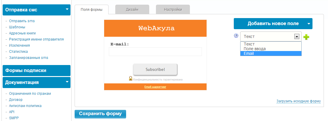
And in the subscription form itself there should be a minimum of information - just an email address and a name. And of course, this form should be visible on the page.