Web navigation: improving and improving

Navigation is what helps the user navigate the site. This is the structure of the catalog in the online store, which helps to find the right thing, the menu of the information site with subsections for different content groups, the list of topics on the news portal, and so on.
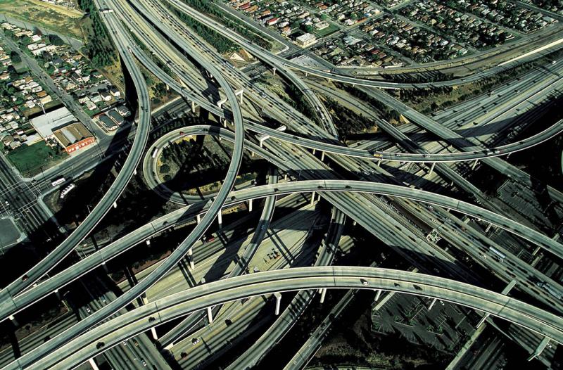
Navigation is always used by visitors regardless of their knowledge of terminology. And the simpler it is, the faster the user finds the information he needs and the better the impression remains from your resource. Convoluted paths, even if they lead to the desired result, can still provide it all the time. But often users simply leave the site in bewilderment, without understanding how to use all this “wealth”.
What should navigation be like?
Here are 8 criteria by which to evaluate existing navigation. If everything is wrong on your site, change it. If you are just creating a resource, be guided by our advice right away so that you do not have to redo it later. So, the navigation on the site must meet the following criteria:
- Simplicity and clarity. Any user who gets to the site must understand how to "handle" the buttons and links. For example, in an online store it should be immediately clear how to get to the catalog with things, to the desired subsection, or how to view a new collection, how to read store news, and so on.
- Compliance with expectations. When the user searches for the desired section, he roughly imagines how it should be called. If you call the overview section "videos" and the instructions section "documents", confusion can arise. Therefore, it is worthwhile to calculate the expectations of users in advance and meet them.
- visibility and convenience. The link should be highlighted and clear. It is unlikely that the user will want to click on all the words in a row, trying to find a link that will lead him to the desired section.
- Appropriate design. When experimenting with design in sections, don't forget about functionality. You should never sacrifice usability in the pursuit of "beauty". And don't forget that elements that look clickable but aren't should not be.
- Subsequence.
 First, the development of the structure and navigation should be carried out, and then the creation of the corresponding pages and content filling. An attempt to do the opposite will lead to numerous failures and complication of the structure. In addition, in the structure itself there should be a sequence like “outerwear - coats - black coats”, and not vice versa.
 - brevity. It's best to avoid many menu items, even if it's an online store. It's always better to nest the structure, leaving up to the 7 important big categories in the first section and then expanding them as many as you need. This is often done in online stores of household appliances, creating the tabs "large household appliances", "small household appliances", "accessories". The fewer elements in the original structure, the more noticeable each of them. If you can't get rid of many of the original elements in a structure, try fragmenting, leaving only the most important.
- Correct location. Even Stirlitz knew that only the beginning and the end are remembered. Nothing has changed: those sections at the beginning are usually perceived as the most important, and those at the end - as new, recently appeared, and then interesting. You can highlight interesting blocks based on visit statistics.
- Visualization. Use fonts of different levels and other visualization elements so that the user can navigate the hierarchy. Intuitively, flat architecture is perceived better and easier.
Do not forget that not only primary, but also secondary navigation must comply with all these rules.