What designers need to remember when creating web products

Let's talk about the rules of "good form" for a web designer, about the code of "correct work", which greatly facilitates the work with the layout for specialists from related departments. And let's start with the technical aspects related to rendering and design. They help make the site complete and ultimately have a positive effect on conversion.
Vector elements and convenient font size

The first rule is to draw all the necessary elements in a vector and save the finished icons in svg. Vector elements scale well and do not lose quality at the same time, so it will become much more convenient to work.
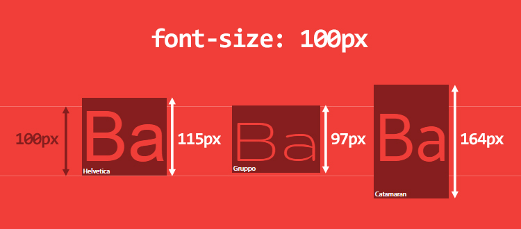
The second rule is to specify the font size as integers. This will greatly facilitate the subsequent work of the layout designer. It is believed that the minimum font size for most text fragments is 14 px. CAPS LOCK should not be used. If you choose the sizes of buttons and other elements, also make them whole. Fractional sizes do not fit into the pixel grid and will look blurry in the finished design.
There is also a rule of thumb regarding line spacing. Do not use the Auto option here, that is, the default settings, and increase the line spacing so that it is 1.5 times the text. Then the lines do not merge, and it is much more convenient to read text fragments. The distances between objects of the same type must also be the same. If you indent 32 px before the first H2 heading, then all subsequent such headings must be exactly the same indent.
Checklist for checking the finished work

It is not recommended to use blend mode or overlay mode in your work. If you convert the background layer to transparent in the design program, and not cut it out, then in the layout program everything will fall into place again, and the image will turn out to be distorted.
Also don't forget the Style Guide. Form a new PSD page with a set of user interface elements. This will allow you to assemble a competent layout, like a designer, and avoid annoying mistakes.
We recommend that you regularly check the checklist in the process of work:
- Favicon - in two formats, png and ico;
- Pagination
- Breadcrumbs (breadcrumbs can be made in small print, from 12 px);
- 404 page;
- Images No Image for product cards and those elements that will be loaded later than the main ones;
- Pop-up windows and thanks-messages (it’s better to immediately put them in a separate file) - these feedback elements are very important for the user, as they allow you to see that the application has been accepted and the order has been placed;
- Drop-down lists in the navigation menu and for filters in the catalog;
- Up arrow to scroll to the top of the page.
All these elements, despite their apparent simplicity, greatly facilitate the user's interaction with the site, which means that they must be properly designed. Do not ignore these recommendations: they will greatly facilitate the work of the designer and the rest of the developers on the team.