What does the logo say?
04.07.2012
A well-thought-out company logo will not only look beautiful on documents, a website and promotional products, but also carry certain information about the company and delight observant people who notice its ambiguity. Here are 10 examples of successful logos.
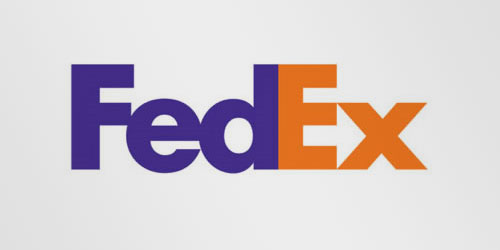
- FedEx . The space between "E" and "x" forms an arrow, which symbolizes speed and accuracy, which are the main principles of this company.
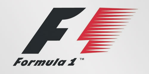
- Formula 1 . The space between the F and the red comb forms a unit. In general, it looks as if the light unit is rushing at great speed over a dark background, spreading the light. And high speed, as you know, is the basis of Formula 1.
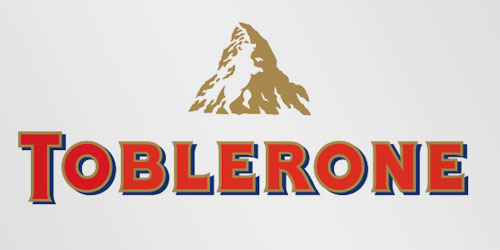
- Toblerone . Swiss chocolate produced in Bern, symbolized by a bear. We take a mountain (one of the Alpine ones will do) and a bear - we get a logo.
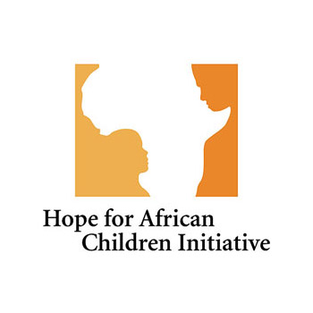
- Hope for African Children Initiative . The logo shows us the African continent, formed by the faces of a child and an adult facing each other.
- Amazon.com . The arrow from A to Z not only resembles a smile, but also indicates that the site has absolutely everything. This is how the name automatically becomes the logo.
- Sony Vaio . The Vaio series from Sony combines two types of signals in its logo - digital and analog. An analog signal is symbolized by the first two letters, forming a wave, and a digital signal by the last two, similar to 1 and 0.
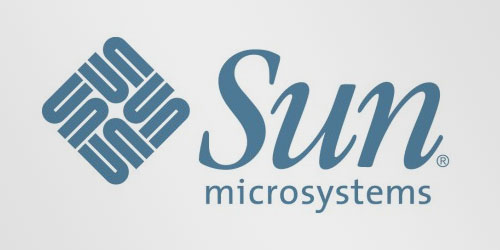
- Sun Microsystems . Their logo is one of the most successful ambigrams - the word "sun" is read from any corner of the square from left to right. This logo was designed by Stanford University professor Van Pratt.
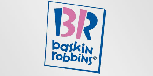
- Baskin Robbins . The letters are written in two colors, and their pink part forms the number 31 - the original number of ice cream flavors of this company.
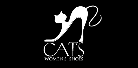
- Cats is a brand of women's shoes. The cat arching its back is very similar to a woman's high-heeled shoe.
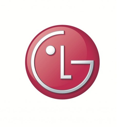
- LG Electronics . Initially, this abbreviation stood for "Lucky Goldstar" - the first name of the company, but later the developers decided to change its meaning to "Life's Good", with an emphasis on improving life with their products. Also, their logo looks like a smiley face.
SUBSCRIBE TO NEWSLETTER
Last in our blog
Internet Marketing
04.11.2019
Internet Marketing
03.10.2019
