Which is better for mobile design: a table or a list?

 Increasingly, developers of mobile versions of the site have to face the problem of how to arrange content. The monitor of a laptop or desktop computer is of sufficient size to arrange the content conveniently for the user. As for mobile devices, there is little choice. When entering the site, the user sees only part of the content. To see the rest, you need to scroll.
So how is it better to have it: a list or a table? Let's figure it out.
List or table?
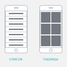 When content is in a list, it is displayed in a column, with no images. The only thing you can use is icons that are flush with text.
Arrangement of content in a table, displays it in at least two columns with pictures. In this case, the pictures are large, respectively, take up a lot of space. There is little text here, maybe not at all.
What's good on the list
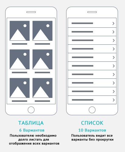 First, the user scrolls the screen less. Where is the connection? Let's explain. When the content is in a list, there are no images in it, which makes the page shorter. And this prevents unnecessary user movements on the site. Yes, visually, it makes the page more attractive. But due to the presence of large pictures, it sometimes becomes incredibly long, which makes a person scroll the page for a long time to reach the bottom.
Second, list content can prevent rash choices. Images stimulate users. And since it takes a long time to scroll, they often stop at some suitable option. A large number of inciting images can mislead the user and lead him to the wrong section, then go back and scroll the screen again.
That's why list content can prevent users from making rash choices. The text conveys more reliable and detailed information in order to help the user make a choice.
What is the effectiveness of the table
 In addition to being more aesthetically pleasing, the table also helps to explore variation and detail. For example, if a person wants to choose a certain thing, he already has some image of it. He finds this item in the catalog menu and, voila! A table renders the most efficient way of presenting such content.
But there are also pitfalls here. If you arrange the main list of the store in the form of a table, then when you see a variety of pictures, a person can simply be distracted. After all, he will need to scroll through a lot of unnecessary pictures.
As soon as a person is in the desired category, pictures are simply necessary. Here he will revise models, study variations, make choices.
conclusions
 As practice shows, most cases of viewing mobile versions of sites are when a person is on the road. And this suggests that the desired content should be found by the user quickly, the pictures should not load for a long time.