Why is minimalism in design at its peak?

Minimalism is in high demand these days. In many ways, this is easily explained by its clear advantages: the user always clearly understands where he is and what exactly needs to be done. Thanks to minimalism, it is easy to manage the user's attention. Modern minimalism is quite a mature trend. Having originated at the beginning of the 20th century, it received its full development in the post-war period and gradually became literally mainstream.
Principles of minimalism
- "Less is more": the minimum set of graphic elements has the maximum information load. As an example, the site of the Italian shoe manufacturer Manufacture D'essai , upon first contact with which one gets the impression of lightness and freshness. A photo of girls with a bright, emotional appearance hints at the company's specialization - products for women. At the same time, no other elements “shout out” the girls. Even at our service not immediately, but at will:

- Eliminate anything that detracts from the main idea of the design. Only those elements should remain “alive”, the rejection of which will make the design meaningless.
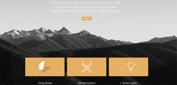
- Create contrast. And at the same time, make sure that all design components complement each other and eventually create a complete idea. Designer Kyle Thacker 's site sounds subduedly dramatic. The backdrop, which challenges anyone who sits in the office, softly clings to bold orange buttons, bringing back the idea of creative work:
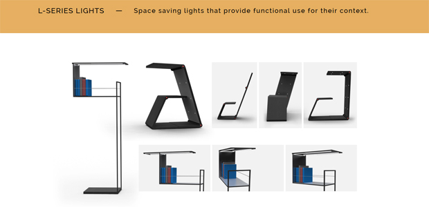
Other pages of the site are devoid of inspiring backgrounds. However, their content is very concise and to the point: drawings, examples, unburdened navigation:
- Do not go too far with the number of colors. Minimalism welcomes 1-2 basic, carefully chosen and often unusual colors. Their task is to attract attention and inform about the main idea of the design.
- Use words to give the user a tour of the page. Break up the text content in such a way that the person travels according to your clues, and exactly in the direction that is interesting to you.
Informational noise, typical for the modern rhythm of life, leads to the fact that minimalism with its seasoned aesthetics seems to be a real salvation. Users appreciate minimalism for its calmness and silence, designers - for ease of use and at the same time - meaningfulness.
Different views on minimalism
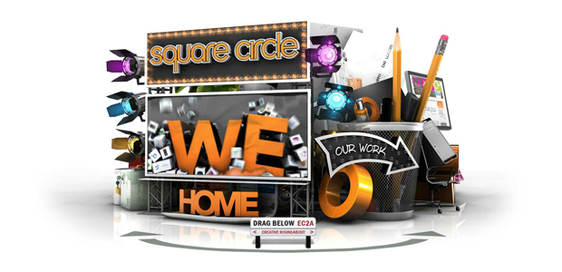
One very important point to be made clear is that minimalism is not for everyone. This is not a universal solution for all occasions. It happens that the customer's field of activity needs a brighter and more graphically expressive design. For example, let's take projects such as Senisoft, Square Circle , Hard Rock Hotel .
In the case of the bold design of Square Circle, minimalism here will not only be out of place, but even empty; minimalism will break the juiciness of details on the Hard Rock Hotel website, but for SensiSoft illustrations, minimalism will turn out to be deadly at all.
The disadvantages of minimalism include its severity and conciseness. It may seem to some that the author does not have enough ideas or content, and someone will consider the formality of minimalism to be overly prim and therefore boring.
And yet, despite the obvious general shortcomings of minimalism, there are quite a few specific arguments in its defense, namely:
- Loading speed is high: the absence of heavy content makes the site light, the load on the server is small;
- Obvious navigation: the user does not have any difficulties with moving around the site;
- A clear focus on content: nothing distracts the user from the goal;
- Adaptability: Minimal design is easy to adapt to mobile devices;
- Special atmosphere: most sites are overloaded with information. There is no such thing here, which creates the impression of being involved in something mysterious and creative.
What is considered a minus, and what is a plus of minimalism, depends on the type of business to which the site is dedicated. To be sure, you can test the beta version of the site on a small sample of the target audience.
Minimal design = business success?
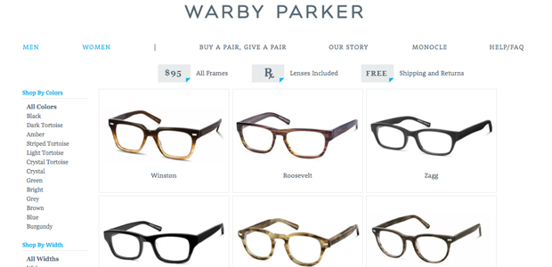
For an online store, minimalism is obviously a good solution. The site loads quickly, the navigation is clear, inclining to purchase. For statistics:
- according to research results, 4 out of 10 customers will leave a site with a slow loading;
- almost 80% of users prefer intuitive navigation, simple interface.
Results
Before dressing your own site in a minimalistic design, make sure that your customers understand you correctly:
- conduct several tests among the target audience to settle on the correct design option;
- add minimalism to the design gradually to avoid customer dissatisfaction;
- consider and reckon with feedback on your new design. If the lion's share of users openly boycott minimalism, make changes, return the old solutions;
- never sacrifice strong marketing and service in the name of a new design.
