Logo for Solid
About the client : Solid is a manufacturer of LED lighting for industrial facilities.
Task : development of a logo that succinctly reflects the scope of the company.
The first version of the logo we created symbolizes the metamorphosis of light and shadow, where the light from the lower left corner passes into the shadow in the upper right corner. Triangular rays illuminate the darkness, which directly concerns the scope of the company. The shapes formed by the intersection of triangular rays are associated with LEDs.

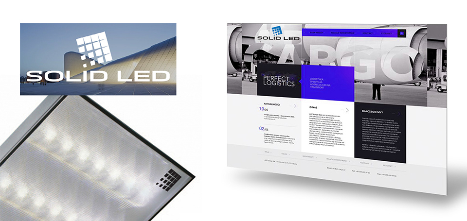
The sign is placed in the lower left corner near the letter "I" and its outermost rectangle takes the place of a point from this letter, which, as it were, radiates light from the center of the logo.

In the course of work, the vector of our searches has changed slightly. The final version of the logo consists of three parts - the brand name, the text inscription "SOLID" and the auxiliary signature "State Lighting". Leaving the idea with a metaphorical image of light and shadow as a starting point, we focused on the geometric shapes in the brand name, which still symbolize LEDs. The text part is written in the author's grotesque font with elongated proportions and a plastic contour of the letters in the places of rounding.


