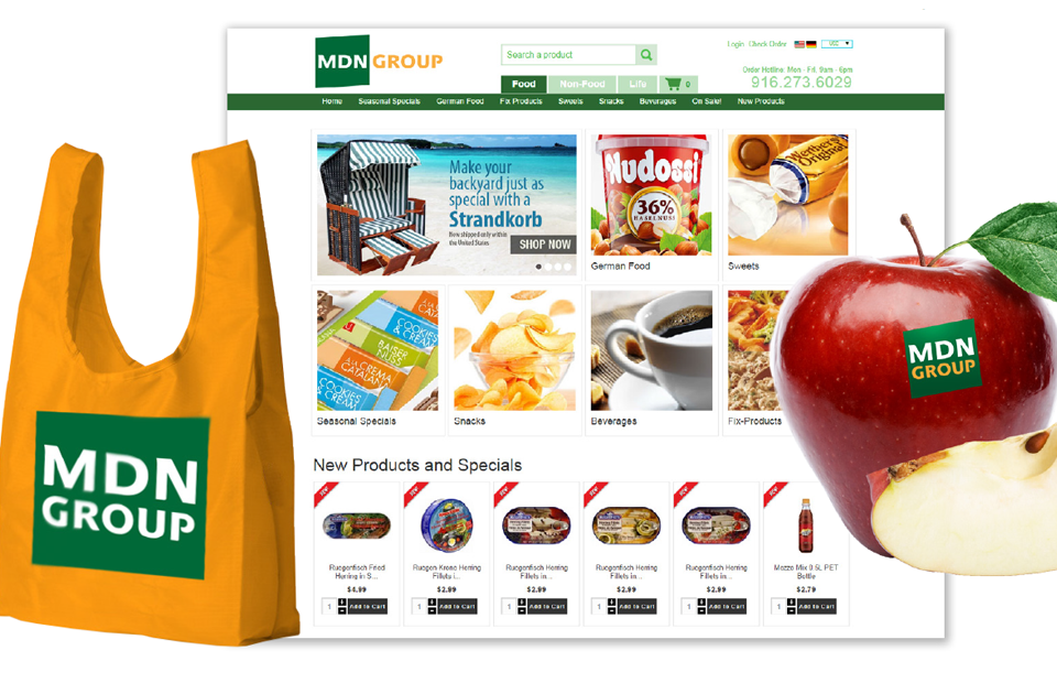
Online supermarket logo
About the client: MDN Group online supermarket.
Task: creating a logo.
The development of any logo in our studio begins with the selection of the necessary associative array for the target audience.
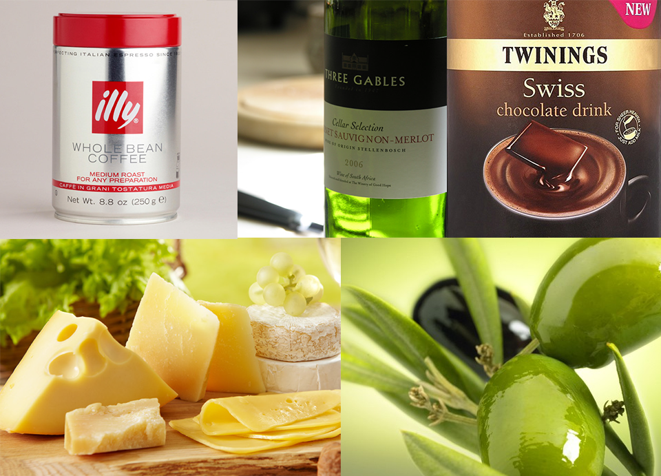
In the field of food, it is customary to use bright spectral colors in combination with white, less often with black. As a rule, one color dominates, while others emphasize it.

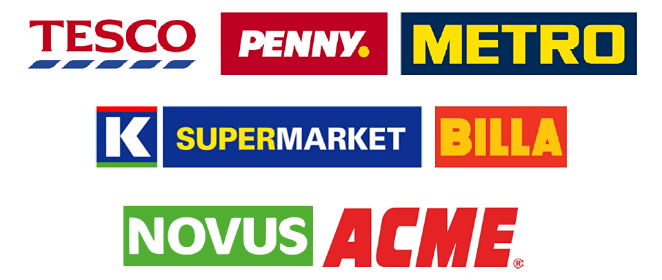
The main trends in market logos are: a large modern font, plus a flat shape below it and the big role of color as a powerful means of brand identification. The absence of decorative ornaments in such logos improves their perception.
The basis of the logo developed by us is an oblique dynamic rectangle and a modern grotesque font. Colors are bright, memorable in combination.
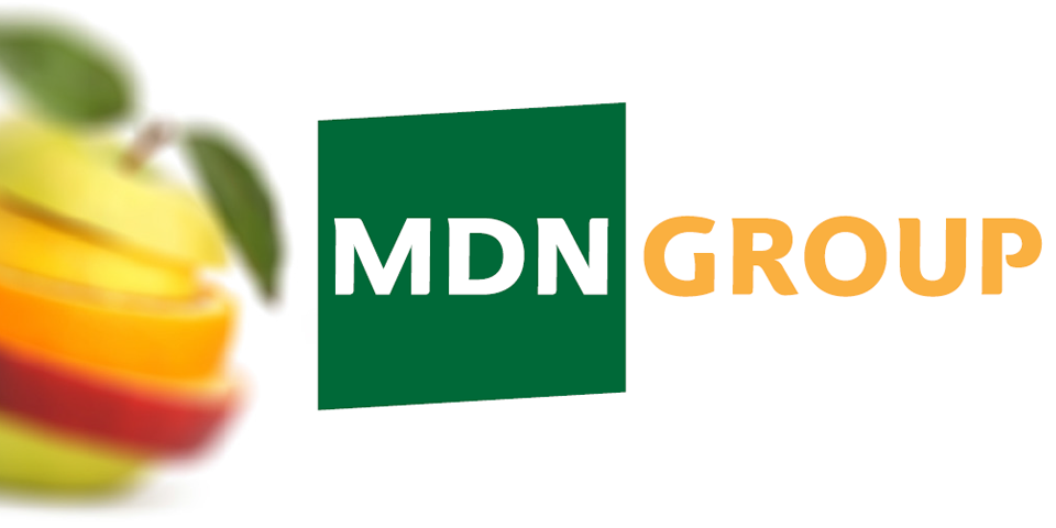
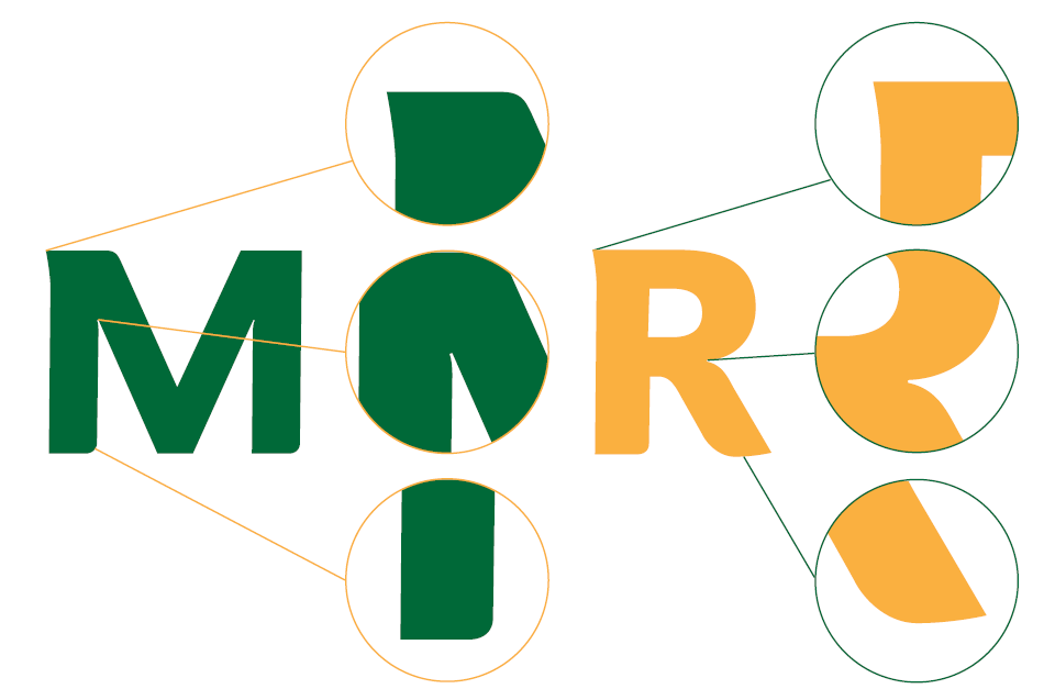
The letters in the logo have a unique shape. Soft roundings at key points create a warm mood. In the letters "M", "N", "R" in the construction, "paint traps" are used. All letters have a slight, imperceptible slant and optical adjustments that are characteristic of dynamic sans. The construction of the logo is based on a module equal to the width of the main stroke in the inscription.
The colors are chosen in such a way as to increase the number of possible combinations: you can use orange on a green background, green on orange and one-color versions of the logo.

For easy reading, the logo is divided into two parts: the abbreviation "MDN" and the word "Group". It is not recommended to write the name in one word, as it becomes unrecognizable and difficult to pronounce due to the sequence of five consonants. It also assumes a vertical arrangement of two words in the logo, as well as the use of an auxiliary signature.
