Case - site audit torgsoft.ua

Not so long ago, we held a competition for the audit of the site, in which torgsoft.ua won.
The key points of the technical analysis and all the results of the usability audit will serve as an excellent example for most sites.
Technical audit works
Torgsoft.ua was analyzed on 43 points, which included an audit of external and internal optimization, the correctness of Google Analytics settings, removal of positions on the semantic core and analysis of current traffic.
The key point is that good traffic is combined with a high bounce rate and a low number of page views per user. Separately, it is worth emphasizing traffic from mobile devices, namely from phones, whose performance is much worse than that of the rest of the traffic.
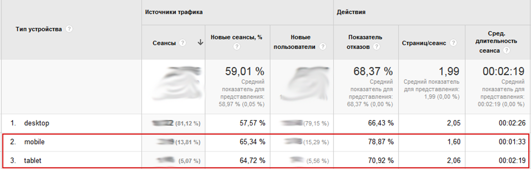
It is noticeable to the naked eye that the bounce rate of traffic from mobile phones is higher than the bounce rate of traffic from desktops and tablets. The parameters “Pages/Session” and “Average Session Duration” have the same dependence.
This is due to the non-adaptive design of the site and indicates the inconvenience of the resource for users.
Usability audit of the site torgsoft.ua
Screenshot of the main page of the site

The key page of the site is the main page, all the rest are informational. Therefore, we analyze the main one in detail with all the functional elements.
Site header
The site header is a navigation menu with a banner logo and a search bar. The navigation menu is laid out “crookedly”:

The parent container has square corners and a border, the nested container has rounded corners and a border. This needs to be fixed either by removing the right and left borders from the nested container or from the parent. "Curve" layout has never been held in high esteem by users, it gives the site some kind of incompleteness and affects the level of trust.
The hat should be reviewed, because. it does not contain some key points:

Let's try to slightly modify the header in the form of a prototype

This site header is more convenient and conducive to interaction.
Offers on the main page

It is better to make suggestions in the form of "tabs" (tabs), because users are more used to it. It is also necessary to swap the navigation with information, and highlight the open "tab" as shown below:

It is necessary to make an automatic change of the active "tab", this will add interactivity and enliven the site.
Mouse transitions along the diagonal are not processed in any way. Those. if a person hovered the mouse over "Kids Stores" and then moved the cursor to the "Learn More" button, then the focus goes to the "Clothes and Shoes Store" tab.

Diagonal transitions must be implemented correctly.
Main page content area
The left sidebar (column) looks sloppy, more on the screenshot:

Also, the sign of the legal protection of the trademark ® appears and disappears, it is necessary to decide whether to use it or not.
The sidebar is saturated with styles: bold underlined text, red button with white text, huge caption, icons, big yellow button, etc. Everything should be done in the same style, the necessary accents can be emphasized more smoothly, for example, by adding a left border to the element.
Right sidebar - links to news, because. the site is informational, then the news is of no small importance, therefore this column has the right to a full-fledged existence. The only remark is to move the “Opinion” block to the central content area of the page, but more on that below.
The central content area is made as an attempt at a landing page, much is missing. Let's take it in order:
- A unique selling proposition (in this case, a competition) - you must immediately briefly describe the conditions of the competition and add a call to action, for example:

Plus, you can add modern pop-up effects to each block.
- The video window needs to be made bigger, it's too small right now

- "Distinctive features of Torgsoft" must be emphasized, highlight each feature with a short and understandable text, accompanied by an image:

- Next, you need to place the “Reviews” block in the form of a slider, preferably with the faces of happy owners of the software.
- Too much space given to useful information. The brief content of the articles should be removed, the titles should be shortened if possible, for example, “Accounting and business control. Common Questions, Mistakes, and Debugging Myths" can be changed to "Frequently Asked Questions".
- It is necessary to summarize with the “Download demo” button and emphasize the free of charge of this action, because the main message of the site is to popularize the program with its further sale.
- This block

can be done much easier:
"Remote Assistance Instructions Here "
If this button was added due to requests from customers, then it is better to put it in the sidebar so as not to ruin the main message of the main page of the site.
Guided by this principle of building a landing page (short description, highlighting benefits, testimonials, video, call-to-action button), it is necessary to turn over all pages dedicated to specific software solutions: Children's stores, Clothing and footwear stores, etc.
Conclusions about the usability of the site torgsoft.ua
The site does not reach its functionality, it seems that at first there was a resource dedicated exclusively to the campaign, and then different people “twisted” it, and now we have separately living elements, each of which is made in its own style. The site lacks a unified design.
It’s hard for the user to focus on one thing, too many “flashy” elements confuse. You need to carefully take all the landing pages and edit them with this audit in mind.
The site has good traffic and at the same time a high bounce rate (68.37%) along with a low number of page views per user (1.99).
The site is not user-friendly for users.
We recommend focusing on the redesign of the torgsoft.ua resource, adaptive layout of the site, and only then proceed to promotion.