Preparing the site for conversions

There are many ways to turn a website into an effective business tool, high-quality design, useful functionality and easy navigation will help. It sounds global, large-scale and unbearable, but you need to start somewhere. Using the example of our recent work, we will tell you how to correctly transform the appearance of the site and improve usability indicators with the help of minor changes.
A task
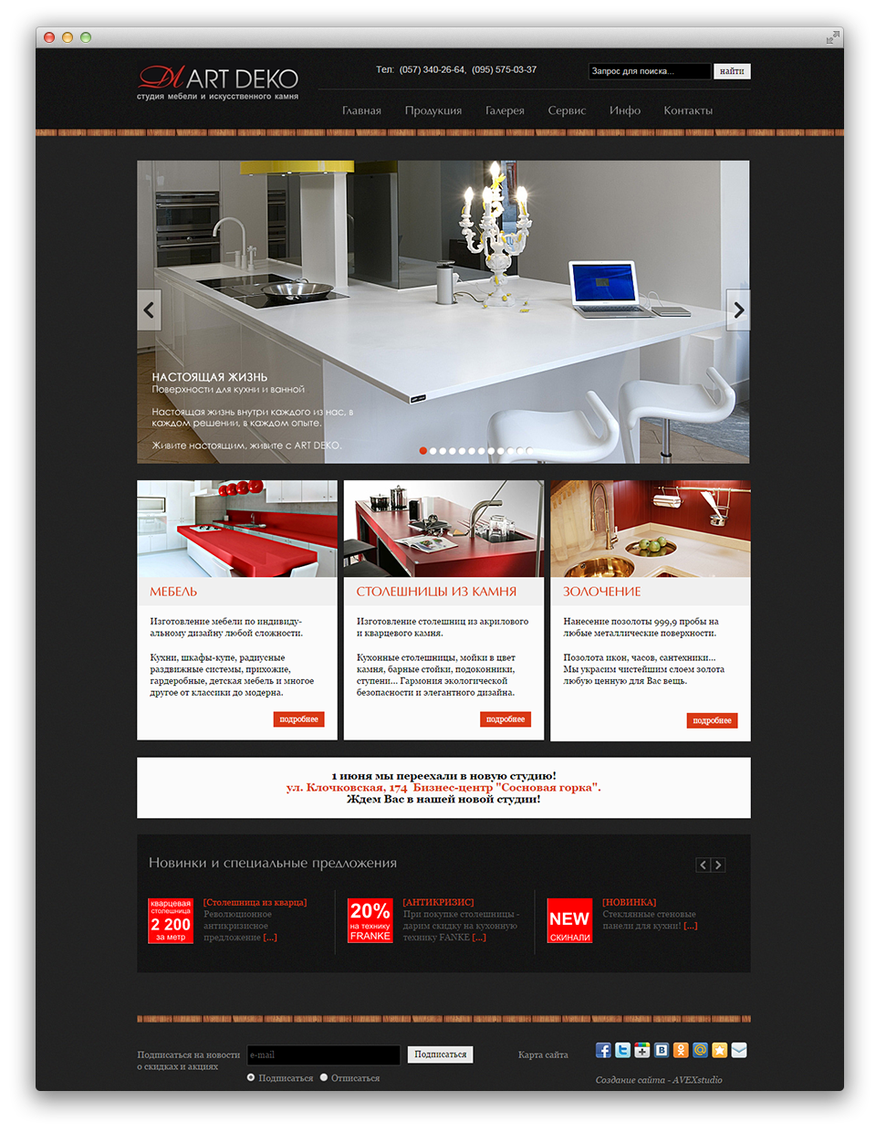
The site of the studio of furniture and artificial stone was transferred to our dexterous hands. This is how we saw him for the first time.
Our task was to put the site in order, or rather, to make its partial redesign. The customer was satisfied with the fonts, a large bright slider on the main page with numerous examples of work, the display of information sections and a catalog. In general, we were also practically not embarrassed by the design solution of the site, but the navigation, the page structure and the layout of the elements of the hand were itching to redo it.
Fixing flaws in site navigation
Confusing main menu.
As always, we started with an analysis of the site structure and identified three main areas of the company's activities:
- stone countertops;
- furniture;
- gilding.
On the old site, with due enthusiasm in the study of the resource, it was possible to find and familiarize yourself with these main commercial sections. However, it is more expedient to bring them to the main menu, which we did.
As a result, we got two types of menus:
- the main thing - with an emphasis on commercial sections;
- auxiliary - with information sections.
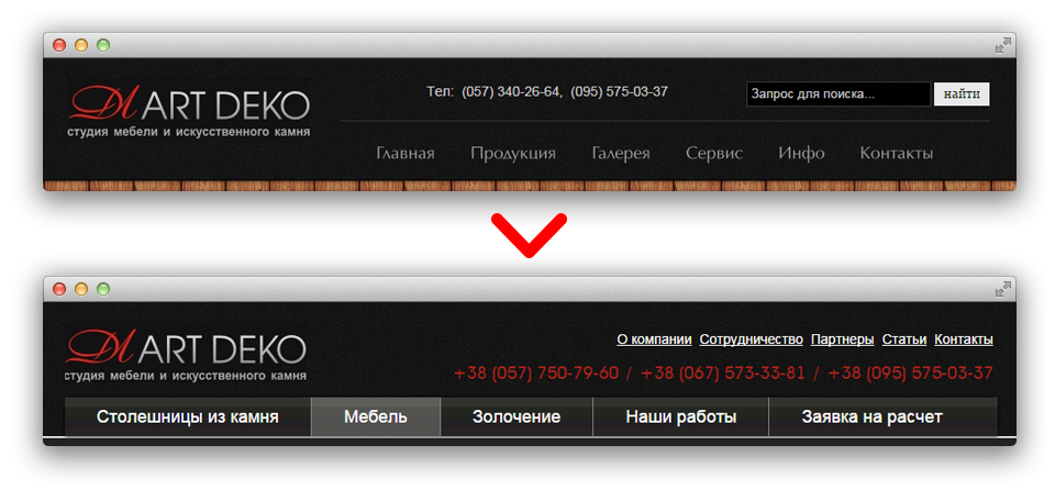 The picture shows the structure of the old menu (top) and the new one (bottom). As you can see, in the original version of the site there was not a word about the main activities of the company. For the convenience of users, we also highlighted in red and increased the font of contact numbers, now it is difficult to lose or miss them.
Invisible sidebar with services on internal pages.
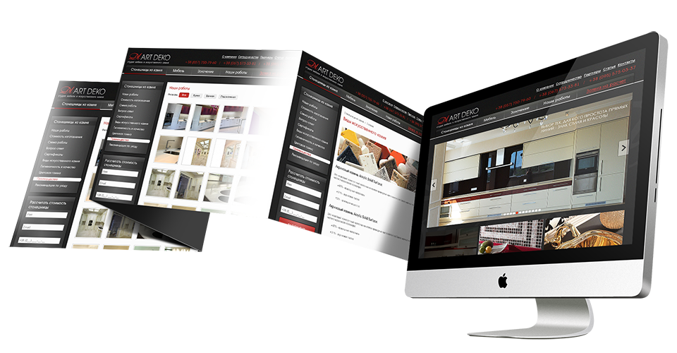
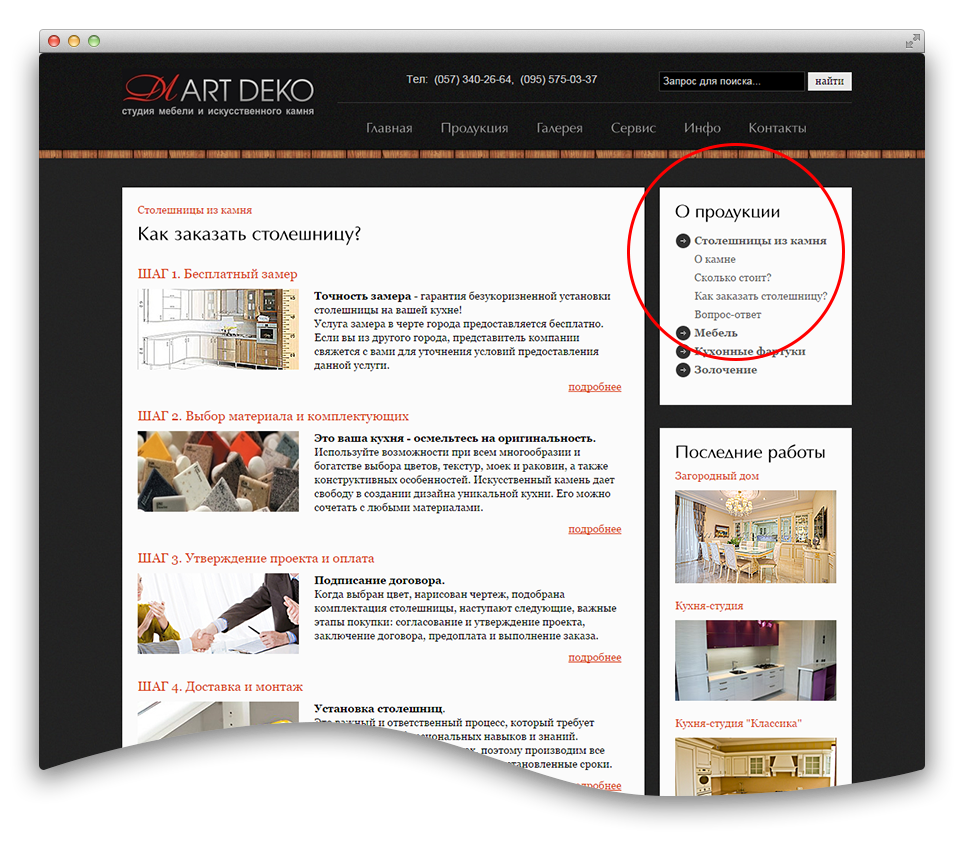 Nobody expects to see a sidebar in the top right corner. We moved it to the left, where it should be according to web etiquette, and clearly marked the active (selected) element.
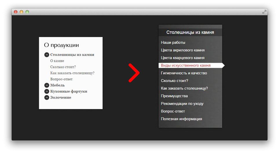 The sidebar has become more informative and voluminous due to linking to the selected item of the main menu. Now, choosing the section "Stone worktops", the user sees sections with all the data about this direction of the company's activity.
conversion traps
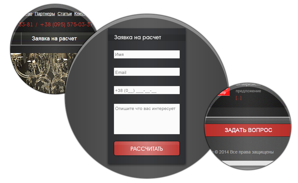
With particular scrupulousness, we placed "snares" to turn visitors into customers and placed on the site:
- product order forms for each commercial section (countertops, furniture, gilding services);
- general form of application for calculation;
- Ask a Question.
Wherever the user goes, our traps lie in wait for him everywhere. No, we are not bloodthirsty, we just want the user not to rush around the site in search of ways to leave a request for ordering a service.
Our work was not limited to "cosmetic" repair of problems, we designed innovations, carefully laid out everything, integrated the site into the MODX engine.
Simplified navigation, emphasis on commercial sections, a variety of feedback forms - the site is ready for any type of advertising.
PS Why we pay so much attention to menus and navigation in our work, and how they can be useful for SEO, you will learn in our next article .

