Responsive web design


The market of Internet technologies is captured everywhere by various mobile devices. There are more and more website visitors from phones, smartphones and tablets. Some analysts even predict that mobile traffic will soon exceed traffic from ordinary computers. In light of such trends, it is unwise to ignore this segment of Internet users and develop sites that are not adapted to modern gadgets. Previously, the best solution to this problem was to create a separate mobile version of the site. But then all portable devices were small in size, and now their screen resolutions are full of variety. A mobile site targeted at small screens will look ugly on a tablet with full HD resolution. In this regard, a new approach to website development has appeared - adaptive web design .
Description of the approach, stages of development of an adaptive site
Responsive design is a website development technology, the purpose of which is the convenience of viewing the site at any resolution. This allows you not to waste time on creating several versions of the site, but to develop one project with a universal layout that will display well on any device, even wristwatches and full-wall TVs.
A responsive layout site requires a different approach to the development process than the traditional one. Close interaction between a web designer and a front-end developer is necessary, in addition, the number of design stages is increasing. Here the typical chain "prototype - design - layout - programming - testing" is not so effective.

Initially, a prototype should be created taking into account the behavior of all interface elements on the entire spectrum of screen resolutions. Then the layout of the prototype and its testing follow - at this stage the draft is run in, the real behavior of the blocks becomes visible when the window is resized, the best solutions are developed in the placement and rebuilding of interface elements.
This is followed by the stage of aesthetic design of the finished interactive prototype: the creation of graphic elements, typography, etc. The opened interface is complemented by this design, after which the turn of complex testing comes. At the testing stage, great attention should be paid to usability, interface flexibility and display correctness. After all the corrections and clarifications, you can start server programming. Finally, it's time for final testing and filling with content.
Not to mention the wonderful "Mobile first" approach. As the name implies, the interface is designed starting with small screen devices and then progressively modified as the available screen real estate increases. Limiting space allows you to concentrate on the most important and does not fill the space with unnecessary functionality, the interface is worked out in more detail and quality.
Responsive layout techniques
Rubber layout
The simplest and most popular technique is to set the page width as a percentage, so that the content area shrinks as the screen width shrinks until it collapses into one long column.
Media queries
Media Queries are part of the CSS standard that allow styles to be applied based on the size of the viewport. With their help, you can transfer blocks to different parts of the page, or completely change their visual display.
Example:
/* start css */

Here are the basic styles for mobile browsers that don't support Media Queries.

@media only screen and (min-width: 320px) {
Styles for devices with a minimum screen width of 320 pixels.
}

@media only screen and (min-width: 768px) {
Styles for tablets in portrait mode.
}

@media only screen and (min-width: 1000px) {
Styles for tablets in landscape mode, netbooks, PCs, etc.
}

/* end css */

Each of the subsequent interpretations inherits the previous one, so there is no need to duplicate styles for each resolution range. As the screen width increases, additional properties will simply be added, and some will be redefined if necessary.
Responsive Images
The image is set to a maximum width of 100%, so it will never crawl out of its parent box and will shrink based on its width. In addition, a large number of techniques for creating adaptive images have recently appeared, which allow you to substitute different images depending on the specified conditions. This means having to prepare several versions of each image: for large screens, a large image, for small ones, a small one:

Advantages and Disadvantages of Responsive Web Design
Advantages:
- CEO
This approach is friendly for search engine optimization: one URL is used for pages, which eliminates unnecessary redirects and duplicate content, and facilitates the indexing process. - usability
The site interface does not change radically, as is the case with a separate mobile version, but gently adapts to different resolutions. Proper design of an adaptive site allows you to make such a transition completely invisible to the user. - Content Availability
The content of the site remains the same regardless of the device used, so users always have access to complete information on the site. The mobile version of the site often cuts content and functionality - this is a harmful tradition based on the misconception that the needs of mobile and ordinary Internet users are somehow different.
Flaws:
- Inability to view the full version of the site
When a site is split into mobile and desktop versions, the user gets to choose which version to view from their device. Responsive layout does not allow such a choice and the user can simply leave the site if the site interface is designed poorly. - Poor performance
Today, a typical website page can be 1MB or more in size, so the speed of work with a slow Internet can be very unsatisfactory. Theoretically, such a volume can be avoided when developing an adaptive layout, but in practice this is not always possible.
Responsive web design is well-suited for content-driven sites like blogs, online magazines, and the like. For a site with a complex interface, it may be more appropriate to develop a separate mobile version or mobile application. This approach requires high qualifications of both designers and developers, careful design and detailed testing. All this, of course, significantly increases the time and cost of development, but at the end we will get a high-quality website and grateful users.
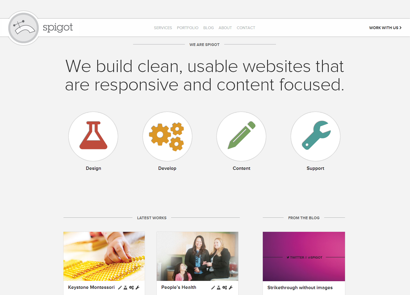
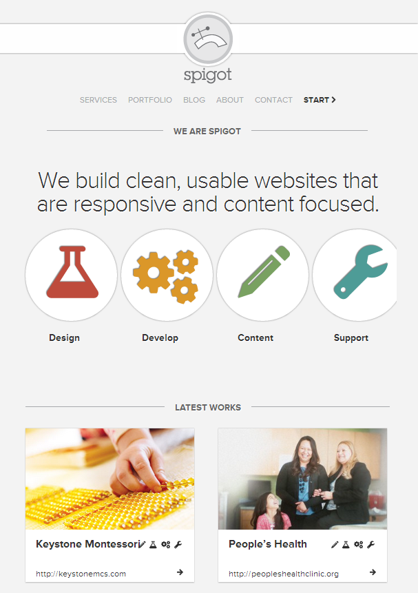
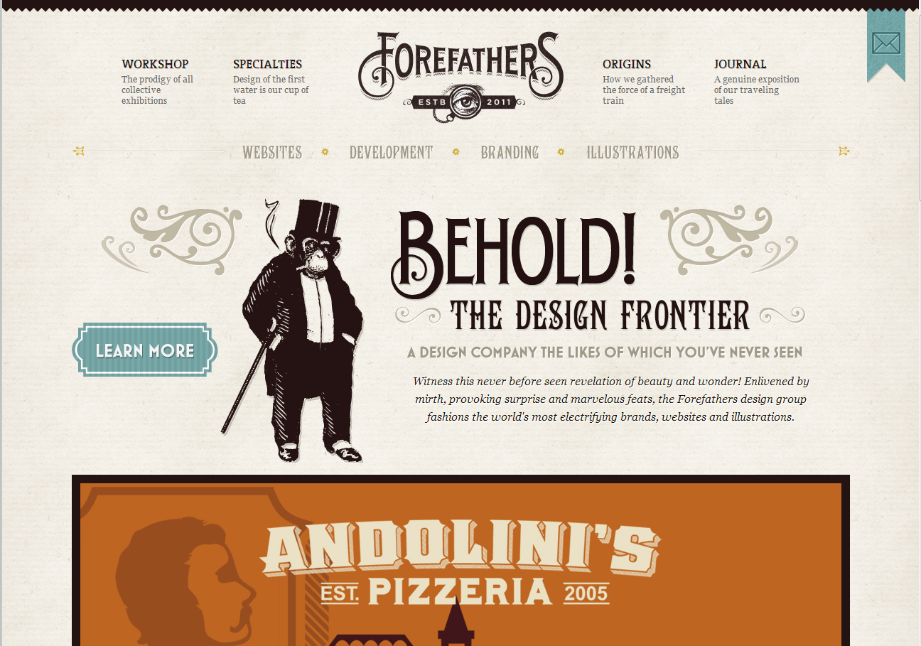
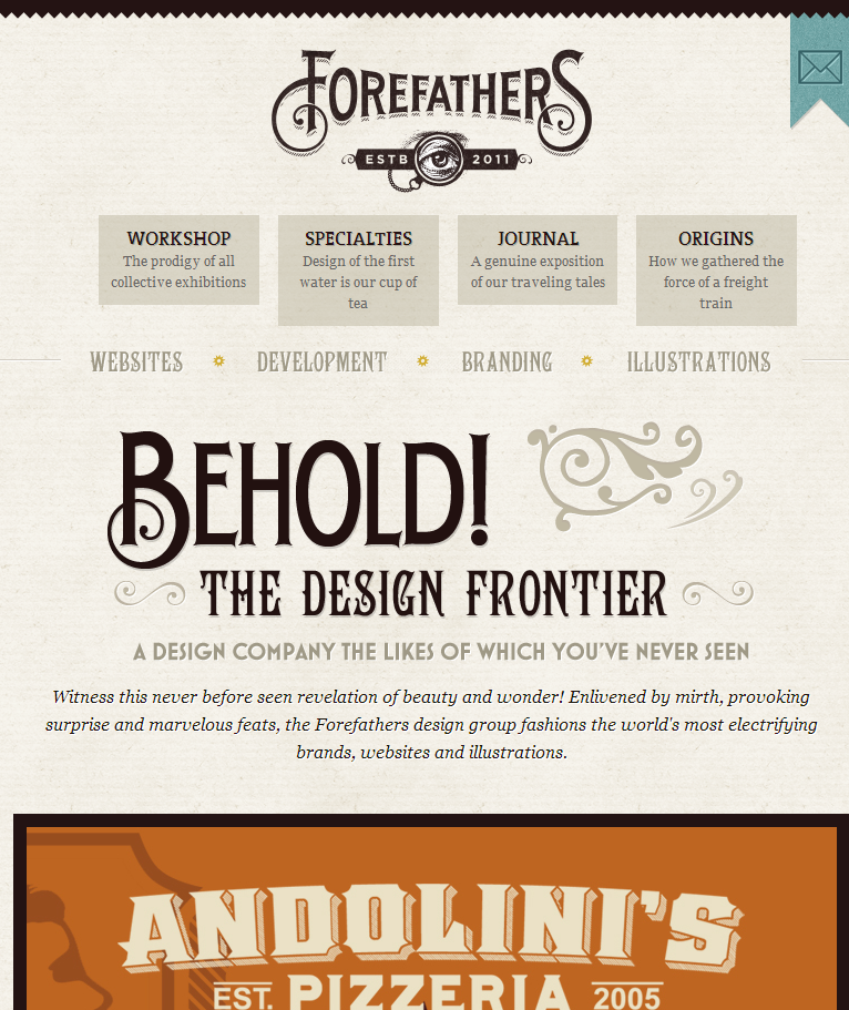
Responsive Website Examples