Typography in web design

The most common form of presenting information on the site is text. Typography knows how to display it. At the same time, web resources are not only sheets of text. Typography is important for the overall look of the site, and for placing accents, and for creating a certain mood among visitors. Today we publish practical tips for website design using typography.
We will not torture you with specific terms, or talk about the origins of typography, especially since we have already written about this;)
Formatting text on the site
Simple font for body text . There is nothing supernatural here. Using a common sans-serif font on an information site or blog is a classic. At the same time, the design of the site will not lose in anything, especially since a healthy share of ornateness can be left in the design of headings and subheadings. The main rule is not to forget about font compatibility , in order to end up with a coherent composition.
On the Internet, for the design of large text, the most popular are:
- Arial;
- Baskerville;
- Century Schoolbook;
- Courier New;
- Georgia;
- Helvetica;
- Tahoma;
- Times New Roman;
- Trebuchet;
- Verdana.
Correct size . Refusal to display small font is another common truth, but with useful statistics;) There is no universal recipe for choosing the ideal font size on the site. However, according to the Software Usability Research Laboratory:
- Verdana and Arial fonts are most readable at 10, 12 and 14pt;
- a high degree of perception of "printed" information was shown by Courier and Arial;
- the worst result at Comic Sans, the font was awarded the titles of "difficult" and "not inspiring confidence";
- the highest reading speed was noted when using Arial and Times New Roman;
- Arial 14pt, Courier 12pt, Tahoma 10pt received positive reviews.
Good manners, alignment and line length rules . Choosing a couple of fonts and the optimal size for them is not even half the battle, but a third of it. Convenience, comfort and other "splashes" to visitors will be provided by:
- balanced text and background contrast;
- logical hierarchy of title, subtitle and body text;
- line length not exceeding 600 pixels;
- well-chosen line spacing;
- use of upper case and center alignment with sapper's precision.
Spectacular and effective typography in website design
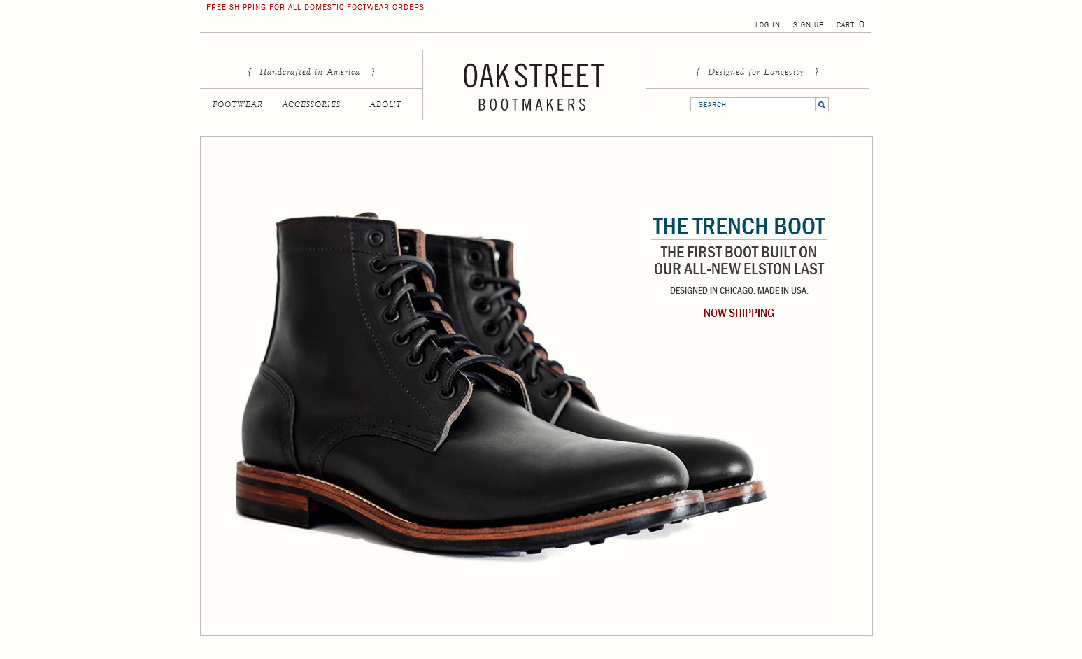
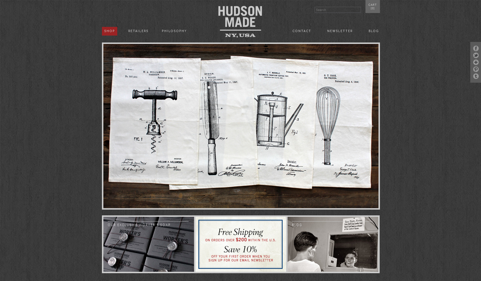
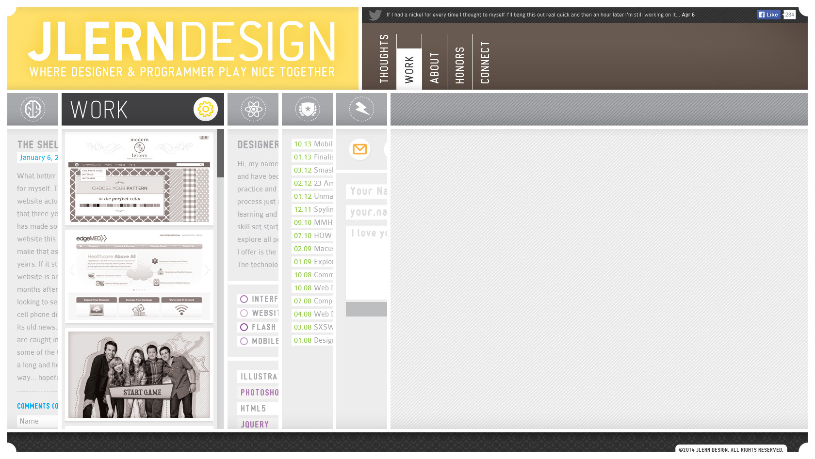
We have repeatedly written that typography, especially large and unique, is now more relevant than ever. We will not repeat ourselves, but we will add some illustrative examples with brief explanations from our designer Alexei.

“On this site, the typography performs its task masterfully. Not sticking out in front of all the content, it only declares its existence in soft italics. A clear subordination and placement of typographical accents are the advantages of this resource.”

“The typography on this site is playful enough to challenge the reader. The interplay between monospaced and narrow styles, italic and slab serif is captivating. It would seem that such a vinaigrette will deprive of structure and usability, but, on the contrary, the resource only won. He's got a unique style."

“Dean standard typography will haunt the minds of designers for generations to come. An excellent resource with strict blocking and typography at first glance, but at a second glance, the fonts no longer seem so gloomy, on the contrary, they are more and more ingenuous.”
A well-chosen typography can be bright, filigree, concise... At the same time, it should not lose its main function - the transfer of written information. The imaginary beauty of the type is useless if it makes the content difficult to perceive.
